Showing posts with label lime. Show all posts

Tuesday, February 19, 2013

Normal: Daily Art Journal Page


Hey everyone! How's it going? Hopefully you all had a good Tuesday; I know I did. However, I do happen to be exhausted. Today I had open gym at my school, and I basically played basketball for at least two hours straight. Like I said, I am very tired. I almost fell asleep on the floor.

Anyways. Enough about that. Let's get onto the art!


Today's page feels quite a bit more graphic to me for some reason. I'm not exactly sure what caused me to go in this direction with the page, but I quite like the way it turned out. To me, it really seems quite reminiscent of Traci Bautista's work. The minute I thought of that, it reminded me of all the old series I used to do on the blog. The work through of the Collage Unleashed book, even though I stopped and started it a million times. And I also brainstormed some ideas for a couple of new series.

I will still be continuing my own challenge, Resize It!, even though I need to sit down one of these days and record. It just seems to be such a hassle. I like doing it though. It doesn't feel like a chore, while, at the same time, it does. It's difficult to explain. It also has a lot to do with the fact that I'm lazy. However, the fact that I started brainstorming a bunch of new ideas means that you guys aren't going to have to simply see my work every day. You get to see my work with some sort of structure. And I hope you'll enjoy that. :)
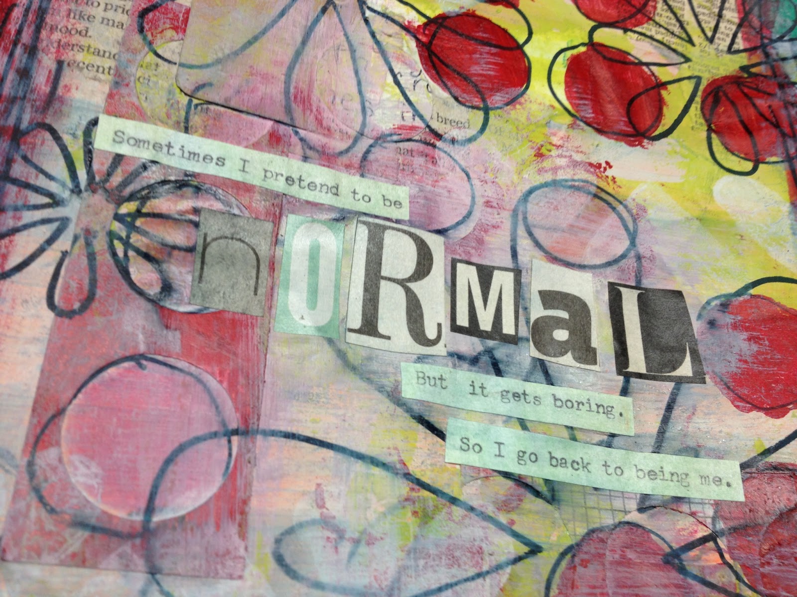

Here's a better look at the quote I used for this page. I love it. So much. I saw it on Pinterest, which just so happens to be one of the most useful tools I've had for art journaling thus far in my life. And that's saying a lot. I can find inspiration for pages, as well as clipart, free collage sheets, and quotes to put on the pages themselves. I just think it's cool.

Anyways. I've had this quote pinned for a while now, and thought that it would make a good page. This describes me perfectly. I'm not normal, and I'm 100% proud to admit it. I don't have a problem with being different, and perhaps just the slightest bit weird. I consider myself slightly eccentric, though I think my sarcasm trumps all. 


I thought that I would leave you guys with just a few detail shots of the background. I did a collage initially, using a bunch of pieces of paper and things that I normally would have thrown in the trash. That's something else that I've been experimenting with a bit. Keeping all of the things I'm tempted to throw away. And USING them. That's the key word. If I don't use them, then there is no purpose to it, at all. It's just clutter. However, if I do use them, that's just more fodder that I can use in my collages and art journaling. 


Just one last thing; I used all kinds of shapes in today's piece; hearts, flowers and circles. Though they normally don't go together very well, I like to think that it works. You can't be afraid to play. I've said it before, and I'll say it again. If I would have stopped at the precise moment I thought I should, only because I was scared of ruining it, then I would have missed out on this great page. If I didn't like the way that it turned out, I always could have tried to cover it up in some way. There are no mistakes in art journaling, only opportunities.

Anyways. I hope you guys enjoyed today's post, and I'll see you all next time. :)

Monday, February 11, 2013

Forget - Daily Art Journal Page


Hey everyone! I'm here again with you guys today, with yet another art journal page. I worked with some more prompts again today; so far I've really been enjoying doing that. 

Before I get started with today's post however, I would like to make a comment. Even though today's page looks like a spread, it actually isn't. I had originally planned to work over the two pages of the journal, but after I had started to try to work it out, I finally decided against it. Tomorrow's page will be built over top of the page on the right. It will add more layers. More texture. More color. And hopefully more interest and depth. Anyways. Onto today's page.


Here is today's page. The idea came about when I was trying to consider what would happen if I became just the slightest bit more graphic with my art. I tend to add a lot of layers in my work, and then one stenciled pattern over the top to add the graphic qualities. So that it doesn't look like everything is blended together. However, I thought it would be interesting to try some freehand paint doodles, just to see what happened. And I have to say, I quite enjoyed the result.


 There aren't very many layers on this page in particular, but that is because I became happy with it so quickly. It is very possible that I could have continued on with more paint and perhaps some stencils. However, I didn't want to ruin what I already had. I loved it far too much. I started off with a random layer of green collage as my base. I took a bunch of my own hand painted papers and simply tore them up randomly. Then I added some lime green paint to the top of that. After that, I added the paint doodles in orange. The oil pastel border followed soon after, as well as the title and journaling, which is actually a quote that I found on the internet. It felt so relevant to me right now that I felt I had to incorporate it. 


I also added some "X's" to the edges/border of the page because of a prompt. The second daisyyellow Prompt6ix has "Treasure Hunt" as one of it's prompts. The first think I thought of, naturally, was "X Marks the Spot." And I decided to use that. 


I had a lot of fun creating this page, even though it didn't take me very long to make. It seems that's how the majority of my things have been lately, as I do have so much going on with school. I personally don't really mind how long something takes me, as long as I'm happy with the result. Anyways.

I thank you guys for visiting me here today, and I'll see you all next time! :)

Saturday, June 30, 2012

Color Challenge #2 Reveal: Barbara


Hey everybody! I'm here with my first post of the day. I may have another one for you guys coming up later tonight, with the rest of my art (My ICAD, 30-30-30 Challenge, and In The Sun post). But for right now, what I have for you guys is my color challenge REVEAL!! I've been working on this challenge pretty much every day since I announced it here, and have really enjoyed it. The colors were lime, light purple, red, pale yellow, and white. Barbara and I decided to do this in a bit of a larger scale than I did last time with Dede. With that challenge, we gave ourselves a week to create one art journal page. And that was cool. But for this challenge, we gave ourselves two weeks to complete five projects. It was a little more time consuming, but I love the results! So let's get on with it!


The first project is a page in my art journal. This is my big, fat art journal with the black cover and green spine. I don't know if I've ever put a picture on here of just the journal, not the pages inside of it. Maybe I should think about doing that. And perhaps a flip would be in order. That way you guys can see about how much I have left to do before the journal itself is done.


Anyways, focusing more in on the journal page itself, let's look at a close up of the page. You can probably see that in the very back of the page is a background that was composed solely up of dictionary paper that I tore up and then collaged down to the background in all different directions using Elmer's School Glue. It actually works just as well as Mod Podge from what I've done so far. Which I think is impressive. Though it could just be me. Anyways, with this page, I actually decided to blend the concept of this page with another challenge. A Year In the Life of An Art Journal. I really wanted to do all of the prompts for this part of the challenge, but I simply ran out of time in the month. That's okay though. There's always next month. :)


And here you can probably see the stamping a bit better. I used my circle stencil, along with 3 found stamps to create these circles. Something that I find popping up again and again in my work is circles. Whether it be deep inside of the layers of a page, the main focus of a page or accents ON a page, it seems that everything that I make these days has at least one circle on it. And if I don't want to use circles, it takes quite a bit to pull myself away from them. It's crazy. However, I have learned to accept it for what it is. Part of my art. And I'm not going to try and change that.


Here is the second project that I did for this challenge. I decided upon a spread for this portion of the challenge, and tried to do a portrait. I don't like it as much as some of the other portraits that I have done in the past, but I believe that to have something to do with my limited color pallet. I couldn't deviate too much from the colors Barbara and I had picked together, so I just went with what I knew would most likely work. However, this did inspire me to work more on my portraits, as this is certainly not my favorite. So I guess it was kind of a win-win situation anyways.


Also, just a question. Does this background look familiar to you guys at all? :) I slipped you guys a sneak peek a few days ago, I just didn't tell you. If you are still wondering where it is, you can click here to see. :)


One of the other projects that I decided upon was a series of ATC's. I decided to count this as a single project, instead of three. I suppose I could have done it either way, but I had some other ideas that I had floating around in my head, so I decided to go with those as well. So I created these three ATCs, simultaneously, as part of a series. They are not identical, but they go together. I would LOVE to trade these! One of my goals for my DayZero Project is to trade 101 ATCS. I am currently at 0. Even though this is only three, it'd be cool to have a few at least.


Here's a bit of a close up of the first ATC. It is titled "TAKE ME TO THE LAND OF JAZZ." As you can see.


Here is the second ATC.


And here is the third. They are composed of many layers of media on top of one another.


Here is the fourth project I came up with for this challenge. I decided to do a mini collage; it measures 6" on each side. I made most of the papers that this collage was composed of as well. The only one that I didn't make was the red grid with the lime circles showing through it. I painted the papers specifically for this challenge, and I still have a whole bunch left over. I'm not sure exactly what I'm going to do with them, but it could be one of many things. Something that I love about this collage though, is all of the little details.


For example, this layered circle that was composed up of multiple layers of paper and paint on top of one another. I love the way it turned out, and is was so much fun to work on. Plus, I love the way the stamped title looks when it was layered with the circle.


Here's another part that I love. I laid down a stripe of lime green paint down onto the page, then punched circles out of the red graph paper. Then I glued it on top of the green. Then, of course, I added the red to the green, and the layer of red stamping along the side. And the lettering. Can't forget that.


Finally, we have the red circles that I added to very bottom to accent the pale yellow and purple background. I tried to go without putting something in every spot, but I just didn't like the way that it looked. So I filled it up. And I quite like the way that it turned out.


And then, for my fifth and final project for this challenge, I have a little mini "canvas". If you follow me on twitter, you might have seen this picture. I was giving you TWO sneak peeks. ;) I wanted to see if anyone would notice, and then put two and two together. Anyways. I was greatly inspired to create this "canvas" by this post. And, the reason that canvas is in quotes, is because it's not actually a canvas. It's a box. A little cardboard box.


You can see that a little bit better here. It has a bit more depth to it than normal canvas. But I really like the way that this one turned out for me. I used pink words on this, instead of one of the colors, but only because I couldn't find any that matched. And this just looked good.

And THAT my friends; that was my color challenge reveal! I hope that you guys enjoyed it! Make sure to check back later for another post. :)

Wednesday, January 25, 2012

Polka Dot Art Journal Page


Hey guys! Jordan is back with you guys today, and I've got something that's actually pretty cool to show you. It's this art journal page. Of course. Again. But I know that you guys love art journal posts, so that's why I'm back. I worked on this page a bunch today, and I really like the way that it turned out. I love the colors, and the way that they work so well together on the page, if you know what I mean. Lime green and black. Two epic colors, one epic color scheme. :D So yeah. Anyways, now maybe I can launch a little bit into how I made the page. It was actually really easy. I actually worked over top of another page, which I've been becoming more and more known to do lately. I took the page, and I painted over top of it with my lime green paint and a paintbrush. I had made some really random doodles on the base with a brown marker, and, as the lime dried, it started to seep through. I know that a lot of people might have put another layer of the paint down, but I'm the type of person who just likes to what happens happen. It happened that way for a reason, so let's not mess it up by trying to do it "our" way. You know what I mean?


Okay. So now let's go onto the next part of the page, which is pretty much the only other part there. But there's a little bit of depth that I want to speak to you guys about. First off, I'm obviously going to talk about the black dots all over the page. You guys have probably seen the stamp that I used to make them in the past, because it seems that I am becoming more and more fond of that stamp by the day. Every time I use it, I seem to create an even greater love for it deep inside of myself. ;) I actually made the stamp myself with a piece of cardboard that I found from a cereal box, and a bunch of fun foam tiny circles that I adhered to the box. I never clean it, I like to let the paint build up on it. When it becomes too much to handle, I'll just make a new one. It was super simple to do. Anyways. Now let's talk about the depth I mentioned. That's going to come to you in the form of the upper left hand corner. See how some of the dots are kind of almost white? Yeah. Let me tell you how I got that. I took my stamp, painted all over with the black paint, and then pressed it down onto the page. Then, there was something important that I needed to do in the other room, so I left it. Without even pulling it back up. It was kind of difficult to remove when I returned, but now I love the effect. Yeah. So anyways, that's all I've got for you today, and I hope to see you tomorrow! Adios amigos!!

Monday, April 4, 2011

99 Art Journal Pages!!


Hello, hello, hello!! I've managed to make it back another day. I'm glad too. I've missed blogging so much and it just feels GOOD to post again. So anyways, yesterday I counted up all of my art journal pages that I've done thus far, and I had 98. So that means that this one is number 99! What a coincidence is that? I had a lot of fun creating this page, but you can't really tell what it took for me to get it like this!! I started it out with a lime green background.

Then I glued a bunch of torn papers to the lime color. So far so good. But then, I added black. And I don't mean a little black. I added a LOT of black. Too much black. So it was way too dark for my taste. I hate when that happens, since I love bright colors. I love them. Love them. So what ended up happening was that you could barely even tell that there was any lime there. There was just too much black.


So what ended up happening was that I added white over top of the whole thing using a paintbrush. I sort of mixed it in with the black, and it created this grayish color. Then I pulled up a couple of the paper strips I put down in order to reveal the lime. I like it a lot. A whole lot better. I just need to learn to control my black. Every time I add something black, I end up putting too much. There's a thin line between too much and too little. And I haven't quite figured it out yet.


I decided that I'd show you a card that I made using the glitter I bought the other day. This is a more sophisticated way to use it I assume. You see, instead of using school glue for it, I decided that I'd use a tape runner instead. The glitter stuck perfectly, if not even better than school glue would. I like it a lot. My only problem is that whenever I try using the glitter, it gets ALL over my clothes. And I never have been a glitter type of girl. Especially on my clothes.


This is the fourth card in a row that I've made for the 365 Cards challenge. It was called 'Up in the Air'. You were supposed to use three things that can be found in the air. I decided to try a new type of approach to this. I used a picture of a dragonfly and a butterfly. Then, instead of another animal or insect like I assumed others may be using, I decided to use the color blue. You can defiantly find blue in the sky, even though it depends on the day.


So now for the progress on my cross stitch. I managed to finish the football except for one line of stitching and of course some of the back stitches I'll be using on top of the actual football itself. Also, I've got started on the next train car I decided to start with. I'll probably work more on that once I get off of here.


Here's a bit of a closer photograph of the finished football and began boxcar. So yeah. I thought it was getting pretty cool. I decided to start on the toys at the bottom and then slowly work my way up into the actual clothing and skin of the little boy. Maybe tomorrow I'll post what this thing is supposed to look like when it's finished. I'm sure I could find a good picture online if I decided to look. See you all next time!!
Related Posts Plugin for WordPress, Blogger...