Showing posts with label blue. Show all posts

Monday, February 11, 2013

Forget - Daily Art Journal Page


Hey everyone! I'm here again with you guys today, with yet another art journal page. I worked with some more prompts again today; so far I've really been enjoying doing that. 

Before I get started with today's post however, I would like to make a comment. Even though today's page looks like a spread, it actually isn't. I had originally planned to work over the two pages of the journal, but after I had started to try to work it out, I finally decided against it. Tomorrow's page will be built over top of the page on the right. It will add more layers. More texture. More color. And hopefully more interest and depth. Anyways. Onto today's page.


Here is today's page. The idea came about when I was trying to consider what would happen if I became just the slightest bit more graphic with my art. I tend to add a lot of layers in my work, and then one stenciled pattern over the top to add the graphic qualities. So that it doesn't look like everything is blended together. However, I thought it would be interesting to try some freehand paint doodles, just to see what happened. And I have to say, I quite enjoyed the result.


 There aren't very many layers on this page in particular, but that is because I became happy with it so quickly. It is very possible that I could have continued on with more paint and perhaps some stencils. However, I didn't want to ruin what I already had. I loved it far too much. I started off with a random layer of green collage as my base. I took a bunch of my own hand painted papers and simply tore them up randomly. Then I added some lime green paint to the top of that. After that, I added the paint doodles in orange. The oil pastel border followed soon after, as well as the title and journaling, which is actually a quote that I found on the internet. It felt so relevant to me right now that I felt I had to incorporate it. 


I also added some "X's" to the edges/border of the page because of a prompt. The second daisyyellow Prompt6ix has "Treasure Hunt" as one of it's prompts. The first think I thought of, naturally, was "X Marks the Spot." And I decided to use that. 


I had a lot of fun creating this page, even though it didn't take me very long to make. It seems that's how the majority of my things have been lately, as I do have so much going on with school. I personally don't really mind how long something takes me, as long as I'm happy with the result. Anyways.

I thank you guys for visiting me here today, and I'll see you all next time! :)

Thursday, February 7, 2013

Heart Investigation 1.1: Cherish


Hello people. I'm back with you guys again today, with some more hearts on yet another art journal page. I have officially decided that I am going to continue working with this shape until I've thoroughly exhausted all of my options. I'm not going to freak out if I don't do hearts one day, but I do think it would be interesting to try to explore it in as many ways possible.

I had actually started this page a few days ago, when I was trying to work with the idea of an entirely blue page, for my 52 Sparks page. However, I got frustrated with it, and completely abandoned the idea. Today, I came back to it with a fresh mind and began where I left off. And I'm glad that I did.


I had to add a bunch of layers in order to be able to get myself to a point where I was happy with the result. Layer after layer after layer. Stamping, collage, and paint. I also used chalk pastels, oil pastels, and sharpies to doodle into the background. Something that I really enjoy doing is taking markers and just doodling a layer. 

It's not what the majority of my pages are made up of; not like some people. However, I do like the way it looks underneath layers of paint and collage. Just a bit unique and different. Something that I quite enjoy.


Here you can see some of the book text that I used on this page. Actually, I use book paper on most of my work. I have an old dictionary that I got from a thrift store, which I simply pull pages out of whenever I need them. They are awesome for collage, and also for monoprinting, when I do that. 


Something that I've really liked seeing in my work however, is the development of my own personal style. It's something that takes a lot of time to come up with, and I'm quite proud of what I've been able to accomplish on my own. I love it. I like to think, personally, that if someone was to see my work, they would be able to tell that it was mine.

Though I'm not quite sure that I'm exactly to that point yet, I look forward to the day when I am. That's one of the things that every artist dreams of, and being even remotely close to that is amazing. Anyways. Thanks for visiting guys! It's greatly appreciated, and I hope to see you guys tomorrow! Bye everyone.

Saturday, February 2, 2013

Calm - Daily Art Journal Page: 52 Sparks


What's happening everyone? Jordan here, with yet another daily art journal page for all of you. Today I actually worked one of Dale Anne Potter's 52 Sparks prompts; the third one for me. She is currently on five. I'm hoping to catch up eventually.

However, today's prompt was to document your favorite color.


Using this page as your example, I'm sure that you can very plainly see that my favorite color is blue. I felt the need to add little bits of red to the page however; I don't think that really pulls the focus TOO far away from the blue. 


First off, I would like to comment that I created this spread in my magazine journal, rather than in my daily art journal for 2013. Or, perhaps, as is probably more realistic, my not so daily art journal for 2013. In other words, just my 2013 journal. This is created in what was once a Delias clothing catalogue. I love the layers that it adds, and I'm recycling. Always a good thing.


For the body, I actually just whited out/colored a body outline that was already there in the catalogue. So I just added my colors and layers on top of that. As you can see in this photo, I didn't really try too hard to keep the girl separated from the background. I like the look of it better when it sort of blends in. That kind of makes it feel, at least to me, like it was actually meant to be there, instead of just being an afterthought. 

Also, I tried, at the very beginning of this page, to add some facial details to this figure. However, I decided that I liked it better without those details, and just painted over it again. That's another thing that I love about art journaling. It's so easy to fix your "mistakes", if you can even call them that. 


Here you can see some of the smaller details of this page, where I added a couple more tiny red hearts to the bottom of the left hand page, to try to tie everything together just a bit better. 


Overall, I really like this page, and I think that it's kind of cool that everything works so well together. I didn't have any idea, at all, going into this, about what I wanted this page to look like. So, taking that into consideration, I think this page extremely successful.

Thanks again everyone for visiting, and I'll talk to you guys later!

Linking to 52 Sparks and Try it on Tuesday!

Friday, June 1, 2012

ICAD #1: Newspaper + "Rise Above It"


Okay. So here I am with yet another prompt page. Today's question asked me which song I thought best represented how I felt above my life right now. I chose the song "Rise Above It" by Switchfoot. Love that band. I feel as if I could be saying these words to all of the people surrounding me in my day to day life; this is honestly how I feel most people feel like. And I feel as if I could have been the author to this song. It's very much how I feel my life is like. Not for me personally, but for people that I know. That I am around. I cut today's title out of various newspaper and junk mail papers, as I have been doing for the past few days. I just love the effect that it gives.


However, I'm not quite so sure how I feel about today's page in general. I mean, I love the way that it looks, but I don't like how thin it is. Today my paper just decided that it wanted to wrinkle up; so much so that I find it difficult to even want to maneuver around it. I am hoping that tomorrow's page, working on the back of this one, will straighten everything out and totally thicken the page itself. 


Today I again used circles, as I keep finding myself drawn to them. But I'm trying to use different colors. Less blue and green, and more warm colors. That's what I was trying to achieve with this page. The journaling is also very much my personal opinion on a topic. I love the way that always turns out to me. Even if I don't like the look of a page, I can always count on the journaling to cheer me up.


Something else that I wanted to share with you today is my ICAD card. This is my very first one, as the challenge started today. Here I used my favorite colors, and felt a whole lot more in my comfort zone that I did with my other page I did today. I also used one of the prompts that she suggested, which was simply "dictionary". So I used some dictionary paper on this card. 


Here's just a little bit of a better view of it. I know that this post is a little bit shorter than the rest of the posts I've had this last week, but I'm pretty tired, and am just throwing this together before bed. Hopefully tomorrow I'll come up with a bit of a longer post for you guys, and even this one isn't TOO short. So yeah. I guess I'll see you guys tomorrow!

Thursday, May 31, 2012

"Extreme" and "Artfest - Cover"


Okay. Today I have two pages for you guys to see. And they are both very, very different. That's the way I like to work though. I feel that if I'm not limited by just one style or medium, then I'll always have countless ideas running through my head; endless miles of ways that I might be able to roam. I love that aspect of it. It's so inspiring. Anyways. The first page I have to share with you is from a prompt, like the last few pages have been. 


Today's prompt asked me the last thing I had said. And that was a single word. Extreme. I know it's kind of weird. But then again, I'm kind of weird too. And I'm proud of that. I kind of took this word out of context however, when it came time to work on the journaling. When I had actually said it, I had used it in the context that the case of hiccups that I had just got over was kind of extreme. But in the journaling, I focus more on the aspect of my personality that forces me to go to extremes to get things done.

For example, I was supposed to leave my math exam at noon today, but I wasn't finishes. So I stayed two and a half hours afterwards so that I would be able to finish. My teacher didn't mind. She said that she liked the company.


I wasn't super fond of this page personally. I like the way it looks, but it really doesn't seem to scream me - not the way the rest of my pages do. It's too subtle. Too delicate. Plus, I think the title "Extreme" kind of calls for something more bold and edgy. But it's too late now. I do think it's pretty. I just don't think that it goes with my style.


 Here you can kind of see, on the right side page, a little bit of what MIGHT be coming tomorrow. Since the flowers are in the very first layer, they could very well be covered up by the time I get to the blog. However, I do have a little bit of a plan. So we'll see. Those flowers, by the way, were made up of the excess paint around the edges of a stencil I used. Just flip the stencil over, and you get a negative space image. Pretty cool, huh?


And here we are. With yet another page. Actually, it's a cover. But that's beside the point. I made these magazine journals a little while ago, and I posted them on the blog back in August. And they have just been rediscovered. By me of course. The moment I saw them, I knew that I had to work in one. A new one. Brand new. From the start. And I wanted it to be interesting. I had just finished the previous page, and I knew that I needed to do something bolder. Edgier. More me. And this certainly accomplished that for me.


The colors are a little bit darker than I've been using lately, but I really like the way this turned out. I love how the circles are so imperfect and wonky - I dislike everything being even and perfect. To me, this is just more appealing to the eye. More interesting and intriguing. If you think otherwise though, that's fine. Not all art journals need to be messy and put through a lot of wear and tear. If you want your art journal to be even, pretty, and have everything to a tee, then that's part of your style. This is a small part of mine.


And I'll leave you guys tonight with a bit of a better view of the title for this journal. I printed this out from an online source; it has the title "Artfest" being signed out in ASL (American Sign Language). I just thought that it was cool, and it really jumped out at me when I was searching through my little box of collage goodies to find a title for this page. And with that, I wish you a good evening, and many more happy, arty days!

Monday, May 28, 2012

In Five Years


In five years, where do you want to be? Interesting question, no? I managed to scrape aside some time today to work in my journal, and I forgot how much I missed it! Sometimes I don't realize how much I honestly need my art time, when I'm so busy in my day to day life. I've been so busy with school that I really haven't done any art at all since the last time I posted, which was a while ago. I think that I need to make sure that I set aside some time each day, especially during the summertime, to work with my art. Maybe even get up an hour earlier, so that I have a nice, art filled morning as a nice way to start my day. And then I'll make sure to come on over here and share everything with you. :)


This page had quite a few layers on it, and you can kind of see the journaling in the background. That's how I've liked to start out quite a few of my most recent pages. It kind of gets you in the mood to work on the page, and, for me, as I've been writing out how I'm feeling about the topic, I start getting ideas on how I want to work the page. For example, as I was writing the journaling for this page, I got the idea to do this page mostly in blues, as that is my favorite color, and this page is very much about me and my goals.


On this page, I decided to do a little bit of a collage on top of the painted background. Sometimes it's kind of hard for me to decide what to do on a page, especially when I haven't worked in a journal for a while (I kind of forget what choices I have!!), but this sort of came naturally to me. I sorted through some of my images that I have collected over the years, trying to look for some interesting black and while images, and any with a blue or purple tint. I had some other pieces that I had culled, but I decided not to use them. That's fine too, just put them back where you found them, and save them for another page. Normally they end up just sitting on my desk until I decide to use them, but maybe you'll be able to work up the motivation to tidy your stuff up. ;) Also, I used my typewriter from the '50s that I got for Christmas to type up some of my journaling. I also hand wrote some of it, to add a bit of an eclectic style to it.


So that's what I have for you guys today. I hope to be back on here tomorrow, and I'll see you then! But, for now, Adios!!

Tuesday, January 31, 2012

Textured Art Journal Page


Hey guys! Sorry I was gone for so long, I feel really sorry about that. I'm actually going to go back and write all of the posts that I had planned for you guys. I've just been so busy with homework. I know that is starting to sound like an excuse, but it's the truth. It's up to you guys whether you believe me or not. Anyways. The page that I have for you today was actually a really fun page to make, and I really enjoy the way that it turned out. I was looking through a bunch of my older paintings and I came across one that I absolutely hated. I know. Horrible, right? But since I've talked about this situation coming up on multiple occasions,  I'm sure you guys aren't too shocked right now. Anyways, I took that page and I simply coated it with a layer of lime green paint. Then I let it dry.


After that, I went ahead and put a few squirts of this light turquoise color on the page. Now, I wasn't quite sure what I was going to do with it yet, but I knew that I could come up with something unique. And so, I took my paintbrush in hand, and simply started spreading it out by dabbing repeatedly with the brush itself. It took a little while, but the end result is amazing. I love the texture that this technique created for me, and I'm sure that I'll be using it again. Anyways. That's all that I've got for you guys today, but I'm sure that I will return tomorrow with yet another post. Farewell. :)

Tuesday, January 24, 2012

Textured Art Journal Page


Hey guys! I'm here today with just a really short post. It's getting kind of late, so I thought that I could just post now and get this sort of over with, if you know what I mean. I just have a single page to share with you guys today, and it was a page that I was really enjoying working on. It's blue and green like a lot of pages that I do, except this one has a little bit of added black and a TON of texture. I don't even really know how I got the texture I did. It's kind of an odd thing; that I don't even know. It's also just a little bit disappointing. Because now I don't even know how to recreate it. I think what I really need to do is start keeping better track of what it is that I am making. Then maybe I won't forget how I did something. I did just a couple of layers on this today; very mundane layers. But I'm already getting ideas for more of them. But I do think that some of the texture comes from masking tape that I laid on the base of the page. I don't know why I put it there anymore, but I do know that I like the effect. But anyways. That's all I've got for you guys today, and I'll see you tomorrow. :)

Saturday, January 21, 2012

Creative Experiments 1.6


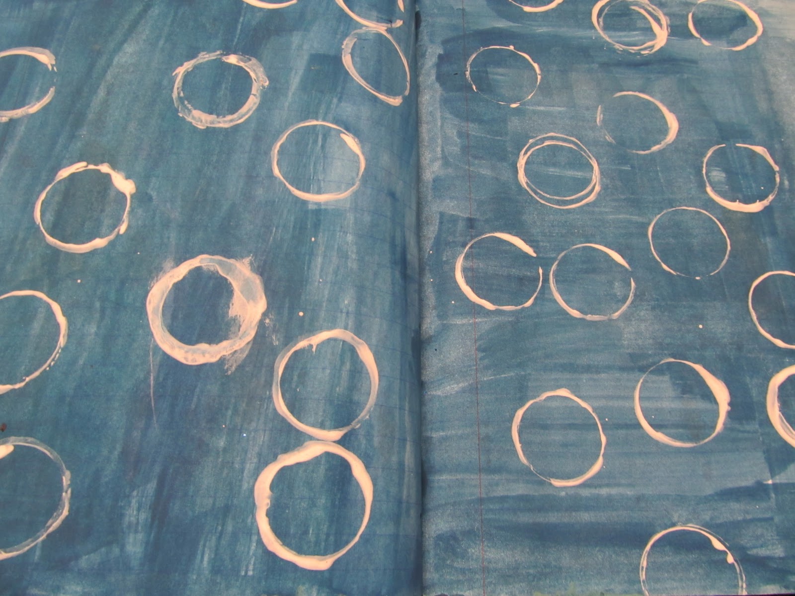
Here I am, back with you guys today with yet another creative experiments post. I love these posts; I guess that I just love being able to find the versatility of a certain supply. As you guys have surely seen before, I've done a bunch of different things with this particular supply. White acrylic paint. That's one of my favorite things to use to tell you the truth. Today I decided to do something with stamping. I already had a page in my art journal that had a dark blue wash on it. I had been making another page and had a dark color of paint. Then, when I was finished working on that page, I still had some paint leftover. So I wet down my pages, and then just painted over the top of it. Then I let it dry. That was a few days ago. Now today, I decided that I wanted to do this Creative Experiments post, and this page was just calling to me.

Basically, I just poured some white acrylic paint onto my pallet, painted it onto the bottom of a paint bottle, and stamped random circles all over the spread. I really love the way that it is looking, even though I don't really know what I'm going to do after this. Sometimes when I'm working on art journal pages, I don't really know exactly what I'm going to do, because I really like the way a page looks after just a few layers. So sometimes I'll force myself to add more layers, and other times, I'll just slap a title on and be done with it. That's sort of what I was thinking I was going to do with this page. I'm still not so sure, but we'll see. We will see.

Monday, November 28, 2011

'Tears' Art Journal Page


Hey everybody!
Sorry that the picture I've got for all of you today isn't the greatest. 
Today, I sadly didn't have any time to work on anything creative.
It was my first day back to school after Thanksgiving break, which lasted for a week.
The teachers assigned tons of homework.
And I still had to get my words for NaNoWriMo.
 But I'm still posting.
Hopefully after November is over, my art count will go up.
Except I will still be working with my book.
Finishing the thing.
And editing and crap.

But anyways.
Back to the point that I was going for.
I'm sharing a page with you today that you may or may not have already seen.
I posted it a little while back, but I added to it.
You also may have see it on the journal flip video I posted a few days ago.
I added the white dots to the title.
Also, the two pieces of ephemera are new. 
Other than that, it's the same that it's always been.
I know that it's not that cool today, but I thank you for checking in with me here!
You guys really don't understand how much your views, and more specifically your comments and suggestions mean to me. 
If you ever have any suggestions for the blog; any suggestions at all.
Make sure to leave me a comment.
I'm always checking all of the posts (there's a setting that allows me to do that).
And it makes me happy when I see a new one.
But anyways.
That's what I've got for you guys today, and I'll see you tomorrow!
Bye!

Saturday, November 26, 2011

Layering Experiment


Hey everybody!
Jordan is back with you guys today.
I'm sharing with you a page that I was working on today.
It was sort of a sample/experiment thing that I was doing for my art journaling e-course that I'm working on.
I've already done a couple videos for that course BTW. :)
It's getting so exciting!

I was playing around with different layers and stuff.
I used some markers, gesso, water, and oil pastels.
Not that much into it thus far, but I really liked the way it was turning out.
I randomly picked the beginning colors with my eyes closed.
And they turned out being my favorite colors!
Blue and green.
With blue being my absolute favorite.

Pretty cool huh?
So I hope that you guys liked the video that I posted yesterday, and I'll hopefully be back tomorrow with some more cool stuff to show you.

Monday, April 11, 2011

Art Never Ceases to Amaze Me


The title says it all. Art never ceases to amaze me. Never had and never will. It seems that the more I work at it; improving my technique and have fun messing around with paint and supplies... the more things happen. Good things. The feeling of freedom you get when you accomplish something. The accomplishment you have when you finish something. The pleasure of browsing through an old art journal and seeing the progress. Page by page. It all comes together and you can see your art journey to where you are today.

The page above is probably one of my very favorite pages I've EVER made. It's also the most recent. You think about that for a minute. It seems that almost every time I create a new page, that is officially my new favorite. It's art. And art never ceases to amaze me.


Take today's daily card for example. If you look back to when i first started up making my cards only a week or two ago, they didn't look too good. They weren't very enjoyable for me to look at, since every time I saw them I was reminded of how much I hated them. But now you can see I like them better. As you work at it, you gain more confidence in your work, and will enjoy working with the materials more than you quite care about the finished project. And sometimes... sometimes what looks like something normal - like the card above for example. Well...


It's not very normal at all.

Sunday, April 10, 2011

From a Sketch to a Card


So I'm back here with you all and a whole 'nother post. Yeah. I just said that. I guess I'm just getting desperate for some new intros... it's sad, I know. So anyways, here's a page that I've been working on a lot lately, and I really liked the way it turned out. Actually, I had started the page a while back, and have pretty much just been adding to it since then. I like it as it is right about now, so this is probably the last time I'll mess with it.


Here's a close up of the title, since I LOVE the way it turned out. I used a bunch of foam letter stamps that were sent to me by a friend of mine as a RAK (thanks Dede!!) and I love the way they look. The tall, stretched out look is totally my style! Here, you can sort of see the faded texture/color to the background that I simply love. It's just hard for me to get it like this. However, when I do get one to turn out, it just makes it that much more special. :)


Last, but certainly not least, I've got a card to share with you guys today. I simply love the way this card came out. I used one of my favorite color combinations (you've probably already detected this from the short time on this blog); lime and black. With lots of white space. I worked from a 365 Cards challenge...


A sketch!!
I love using sketches, and you maybe can see where the idea for this card came around. I basically turned the sketch on it's side, and used the bracket in place of the half hexagon. I love it. It's fun using sketches, at least to me. I love the thought of sketches, and they're just so fun to use. If you haven't already, I suggest you try them!!

Monday, April 4, 2011

99 Art Journal Pages!!


Hello, hello, hello!! I've managed to make it back another day. I'm glad too. I've missed blogging so much and it just feels GOOD to post again. So anyways, yesterday I counted up all of my art journal pages that I've done thus far, and I had 98. So that means that this one is number 99! What a coincidence is that? I had a lot of fun creating this page, but you can't really tell what it took for me to get it like this!! I started it out with a lime green background.

Then I glued a bunch of torn papers to the lime color. So far so good. But then, I added black. And I don't mean a little black. I added a LOT of black. Too much black. So it was way too dark for my taste. I hate when that happens, since I love bright colors. I love them. Love them. So what ended up happening was that you could barely even tell that there was any lime there. There was just too much black.


So what ended up happening was that I added white over top of the whole thing using a paintbrush. I sort of mixed it in with the black, and it created this grayish color. Then I pulled up a couple of the paper strips I put down in order to reveal the lime. I like it a lot. A whole lot better. I just need to learn to control my black. Every time I add something black, I end up putting too much. There's a thin line between too much and too little. And I haven't quite figured it out yet.


I decided that I'd show you a card that I made using the glitter I bought the other day. This is a more sophisticated way to use it I assume. You see, instead of using school glue for it, I decided that I'd use a tape runner instead. The glitter stuck perfectly, if not even better than school glue would. I like it a lot. My only problem is that whenever I try using the glitter, it gets ALL over my clothes. And I never have been a glitter type of girl. Especially on my clothes.


This is the fourth card in a row that I've made for the 365 Cards challenge. It was called 'Up in the Air'. You were supposed to use three things that can be found in the air. I decided to try a new type of approach to this. I used a picture of a dragonfly and a butterfly. Then, instead of another animal or insect like I assumed others may be using, I decided to use the color blue. You can defiantly find blue in the sky, even though it depends on the day.


So now for the progress on my cross stitch. I managed to finish the football except for one line of stitching and of course some of the back stitches I'll be using on top of the actual football itself. Also, I've got started on the next train car I decided to start with. I'll probably work more on that once I get off of here.


Here's a bit of a closer photograph of the finished football and began boxcar. So yeah. I thought it was getting pretty cool. I decided to start on the toys at the bottom and then slowly work my way up into the actual clothing and skin of the little boy. Maybe tomorrow I'll post what this thing is supposed to look like when it's finished. I'm sure I could find a good picture online if I decided to look. See you all next time!!
Related Posts Plugin for WordPress, Blogger...