Sunday, July 22, 2012

ICAD Update: Cards 50 - 51


Hey guys! What's going on? I'm here with a couple of ICAD cards for you guys today, and I hope you enjoy. They're really just some more zentangling ICADs that I was working on as part of a "series" of sorts. I wanted to try out my new papermate pens on something (I got 4 new colors) but I didn't know what. So I decided to do something with my ICAD cards. I had done the zentangling before, but not in color. So I decide to try it. This green one is from a couple of days ago.


This purple one was from just yesterday. I actually really love the way that this turned out. The thing with zentangling, at least for me, is that I will often times run out of patterns to use on the cards themselves. I just can't think of any more. It's a rather difficult dilemma. I know that I could simply go online and search google for some ideas, coming up with literally thousands of patterns in the process. However, when I'm right in the middle of something, I find it rather difficult to do so. To tear away from the work that I am doing right at that moment. So maybe, not that I'm really thinking about it, what I should really do is to look ahead of time, before I start my doodling. Maybe it'll help a little. Maybe it'll generate some more ideas. Maybe.

Anyways. That's all I have for you guys today; I'm considering popping in tomorrow with a tutorial for all of you. We'll see. We will see. See you then!

Saturday, July 21, 2012

Quick Update - Dr. Who


Hey guys. I know that I'm late coming in today. And I know that there seem to be more and more of these "short post or no post at all" days. But I'm really trying to fix that. Today I wasn't really so much busy as I was sucked in. Sucked into Dr. Who that is. I was seeing a whole bunch of stuff about it all over pinterest and tumblr, and I just couldn't control myself. I had to watch an episode. And even though the rest of my family was done with it after about two episodes (right when we started getting to the aliens; figures) I just couldn't leave it at that. I wasn't totally sucked in at that point. I kind of liked the idea, but it hadn't grabbed me yet. Then I decided to give it another chance. And I was sold on it. Totally and completely sold. I just finished the first season today, and started the second. It's kind of weird because of... certain aspects (people who have watched it will know what I'm talking about; I don't want to give any spoilers), but I'm sure I'll get used to it. And I like it. A lot.

ANYWAYS. Stepping away from the Dr. Who aspect of it all, I really didn't do that much today. I did a little art, but not much, which explains the photo above. I'm fairly certain that it's been shown here on the blog before. But I didn't want to leave you photo-less as I ranted about television shows I like. And that's that. I'll have some more art for you guys tomorrow, I promise. I missed it.

Friday, July 20, 2012

Summer of Color 2012: Week 6 + Challenge Announcement


Okay all. I have something pretty cool to share with you guys today. At least I think it's cool. Though I am biased. It is my work, after all. Anyways, I am presenting to you, today, Week 6 of the Summer of Color 2012, in which the colors were a pink and a black or dark brown. I used some of both. An extremely dark brown. Again, I made my painted papers, as I did in the past, this time creating a total of eight. I had it worked out in such a way that I would be able to come out, in the very end, with a total of 40 painted papers. And I achieved that goal effectively. I have decided, somewhere in the middle of this challenge that I was going to add onto this challenge on my own time, and I will actually be inviting you guys to participate in it as well. But I will discuss that later on in this post, after the reveal of all the papers I completed for this challenge in the past 6 weeks.

Let's get started now, shall we? Okay. I had quite a few ideas for these papers this week, which made them go so much faster. It was nice to not be struggling to figure out what I wanted to do with the blank pieces of paper I had staring at me. The two above each started with a watercolor wash background; the one on the left with black, and the one on the right with pink. I added acrylic and watercolor paints as another layer on top of the background to create the effects shown. Also, with the stars, I outlined the pink stars with an oil pastel (non water-soulable).


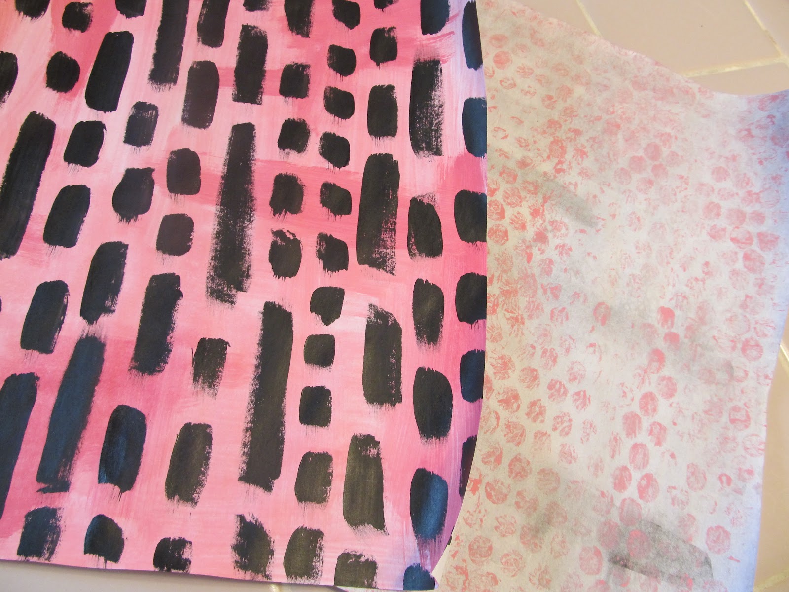
These papers were very simple to complete. Each only consisted of two layers each. The one on the left, I started with an acrylic paint wash over the entire background, to create a vibrant, but not TOO vibrant color. Then, I used some black acrylic to paint the lines and squares over the entire page. I've done things similar to this on art journal pages before, so I just thought it would be fun to play around with. With the page on the right, I used a dark brown watercolor paint (extremely watered down) for the background. Then I took some bubble wrap and stamped with pink acrylic paint over the entire page. And that was that.


These pages were fairly simple as well. The one on the left is simply composed of layers of watercolor paint on top of each other. The one on the right is a bit more complex, though not a whole lot. I started off the page with a white roseart crayon. Then I used it to draw circles all over the entire page. I didn't really pay too much attention to where I was putting the circles, as I couldn't see them that well anyways. Though, I did do my best to cover the entire page with these circles. Then I used black and pink watercolors over the entire page to resist the crayon.


Here, the page on the right also uses a crayon resist, though I used a black crayon that I could actually see. I drew a bunch of little black dots all over the page, then used an acrylic wash to resist the color. Out of all the papers that I made today, this has got to be the one that I am the least fond of. However, that's okay. It's not too bad. The paper on the right was extremely easy. Just alternating stripes of black and pink watercolors. And that was that. Technically only one layer. But I love this one layer. It's just cool.


Now, before I actually get to the challenge that I'm going to be announcing, I would like to share with you one picture that sort of reviews all of the papers that I made this past 6 weeks. I separated them into their specific weeks, but other than that, they are in no particular order. When they are all stacked, I came up with a stack that's a bit more than an inch in height. That makes me proud. I can see that I have actually accomplished something. And it's crazy, because this is actually my second challenge that I have completed this summer. Last summer I started a whole bunch of challenges, but didn't complete anything. Sadly. However, this is my SECOND completion (the first, of course, being my 30-30-30 challenge, though I'm still trying to decide what to do with those loose pages) and I am expecting to have two more at the end of the month. :) And perhaps some more next month. It just makes you feel so completed, you know what I mean?

Anyways, moving on, let's get to the challenge itself that I am presenting all of you faithful viewers of my blog. First off, I thank you for being here for my first challenge I am presenting to you guys. It means a lot to me. So here we go. The challenge that I am presenting you guys with is the "Limited Supply Challenge". I know that it doesn't have a big fancy challenge name or anything like that, but that's okay, in my opinion. It's realistic. It's real. And that's what I like. This challenge actually developed from my desire of wanting to do something with the increasing stacks of papers that I was creating in my studio, and also wanting to have a purpose for my Summer of Color papers; you know; the ones I just showed you. So that's what this challenge is going to be about. Using up all of the painted papers that we have created. And, if you don't have any papers yet in your collection, don't worry. You still have some time to prepare. And actually, they don't even have to be hand painted.

They can be anything that you want them to be. However, I am going to set a rule. I want these papers to 8 1/2" x 11". If you want to use scrapbooking papers (which is fine, by the way), I would prefer it if you would trim them down to that size. The reason for this being that I don't want anybody to have any more or less material than anybody else. So here's the deal. We are going to make as many art journal pages, ATCs, mini book pages, scrapbook pages, collages; WHATEVER. We are going to make as many projects as we can with these papers that we select until EVERY SINGLE SCRAP of paper is gone. I know that sounds like a lofty goal, but doesn't it sound fun?

Here's the deal. These are the supplies you are allowed:

1. 40 sheets of 8 1/2 x 11 printed/painted/collected paper. 
In 6 color schemes. 
5 of the first two.
 6 of the third. 
And 8 of each of the last 3.

2. 5 paint colors. These can be any kind that you like.
I recommend red, blue, yellow, white and black.
Because I am graciously allowing you to mix your colors. ;)
Also, if you would prefer anything else (colored pencils, oil pastels, crayons, etc) because that is the medium you work in, feel free to substitute paint with that supply.
But you can still only have 5.

3. A journal. Or canvas'. Or blank sheets of paper.
In other words, any surface that you want to work on. I am not limiting you at all in this aspect. Not a bit. You can do what you like here.

4. 15 Texture stamps.
This can be anything you want. They can all be collected stamps if you want.
Bubble wrap.
Mesh from an old window screen.
A sponge.
Or stamps you bought. But 15.
Of course, if you don't want to use stamps, you don't have to.

5. Any other BASIC supplies.
i.e. scissors, glue, pencils, pens, white copy paper, etc.
But that is all.

And that's the challenge!! Limited supplies. To use up a total of 40 papers. Who's going to join me? I believe that I will start the challenge on the first of next month. Are you guys ready for this? Do you want to join me?

Thursday, July 19, 2012

ICAD Cards: #45 - 49


Hey guys! I'm back with you guys again today, and this time with an ICAD update. Sorry that I wasn't able to post on the blog yesterday, but I've decided that I'm not going to beat myself up about it. I don't have to post on the blog EVERY day in order to be a success, which was pretty much my mindset before. I'll make it my goal to post every day, but if there's ever a day when I just don't feel in the mood, I'm not going to push it. I'm just going to do a post when I feel like it. Which is pretty much every day anyways.

So. Let's get started, shall we? Today I have a total of five cards to share with you guys, and each of these cards was done on the lined side with a pencil. These are my first pencil cards. And I rather liked the way that the majority of them turned out. I guess I was going for a sort of mini series. The first card was just playing around with different three - dimensional boxes in different shapes. I just wanted to work with these shapes; I've been drawing these little boxes for fun for a while now. And I just wanted to do them on a card. Don't ask me why, because I honestly don't know.


The next card that I want to share with you was composed of a bunch of noses. None of these are extremely good, but that's why we practice, am I right? I was working with realistic looking noses on this card, though I could have easily thrown in a couple of cartoon or manga noses into the mix, as I do with some of my later cards. I learned, from my dad, that noses are primarily drawn with shading. Though I think that part of the reason that these noses don't look very good is because they aren't part of a face. I mean, if the nose is part of a drawing of a face, then you can work the shading into the face as well, making it look better overall. I don't know though. That could just be a guess. Though I have done faces in the past with this type of nose, and they turned out fine.


The next card I was playing around with some different types of eyes. I did a pair of cartoon eyes, a single realistic eye, and a couple of manga eyes. I wanted a pretty good mix on this card; I might even go back to it. I'm not sure. I think my favorite eye is the manga one to the far left. I just love the shape of it. 


The next card is composed solely up of different sketches of lips. I did these in different ways; tried out different shapes for the different "layers" that create lips, tried different textures, different methods of shading, different lengths and heights, etc. I just really wanted to have fun with this. There are no lips here that are extremely "realistic", per say. But with a bit more texture, a few of them could be.


And then, of course, my final drawing that I want to leave you guys with this evening is a card that I completed just this evening. It was also done with pencil, the same as the rest of the cards, and on the lined side of the paper index card. I did a mandala. I think this is my first mandala for this challenge, and as I hadn't done one in a long while, I found it quite pleasing to do. It was quieting, comforting, and gave me a chance to play with line and design. And it was fun.

Anyways. That's all I have for you guys tonight. Tomorrow I will most likely be sharing with you guys my FINAL Summer of Color 2012 collection, and may or may not show a collective view of all of the papers. And maybe I'll mention something about the idea that I have for these papers that I've been doing. I'll see you guys then.

Tuesday, July 17, 2012

Mostly Pics Envelope Journal Flip


Hey guys. I'm back with you guys again today, but with a bit of a different post than what I normally do. I was gone all day today at a water park, so I didn't get to do that much art. Some, but not a lot. So, today, I think the post is going to be mostly pictures. This is pretty much a flip through of my envelope journal that I've been working on. Most of the pages only have a few layers of medium on them so far, but some have a bunch, and are extremely close to being done. So let's get started!


This is going to be a 31 Hearts page.


The tape was a piece of clear tape that I just rubbed the paint off of when I painted the background.


Leftover watercolor experimentation.


And that's it! I know it's a lot of a shorter post (less words) than normal, but I'm extremely tired. If you have any questions though, feel free to leave a comment. I will answer you as soon as I read your message. ;) Thanks again!

Monday, July 16, 2012

Color Challenge #3 Reveal!


Hey guys! I'm back with you guys again today, and this time I have a color challenge reveal for you guys! This was the date that Barbara, Mavis and I had decided upon to do for the reveal, and I finally get to share with you guys all of the fun art that I've been working on this past 10 days!! And I'm excited to do so! First, let's reveal the colors. Although you probably already saw the photo that I put above, I'll tell you the colors anyways. And they are pale blue, vermillion and purple. ALSO. As I said when I first revealed that I was going to be doing another challenge with Barbara (and I'm glad I did; she was a pleasure to work with as always) I mentioned that there was going to be a twist for this challenge. And that was the use of word prompts in the work. 

Barbara and I came up with the colors and words; she crowd sourced two colors (vermillion and purple), and then added the word prompt life. I added the pale blue color and the words energy and passion. We decided that we somehow needed to incorporate these words into our work, and I found this a wonderful challenge to try in comparison to some of the things that I've been doing lately. All three of the projects that I did for this challenge were art journal pages of one kind or another, but I'll focus more on what journal they were done in when I get to them.


The first page that I would like to share with you guys today is this art journal page that I decided to do in my 5,000 Question Survey journal. In case you aren't really a follower of my blog, the 5,000 Question Survey is a survey that was put together for people who were looking for journaling prompts to work on in private or in public; it really depended purely on the person. Well, I saw those prompts, and I saw art journals. Art journals all the way. And from there, this journal was born. I've probably done about 20 pages, give or take 2 or 3. The question was kind of a deep one, in comparison to some of the others. It prompted me to answer the question; "What is the truest thing that you know?"

Well. That one took a lot of thought, let me tell you. At first, it didn't make sense at all, since my brain, which so yearns for accuracy kept telling me that one thing cannot be any more true than another. Of course, I believe now that I was over thinking the whole question, but, after some time, I realized that one of the word prompts; life; actually went very well with this question. Though I still don't believe that life is the "truest" thing that I know, it is true, never the less.


Life is one thing in this world that cannot be denied, no matter how hard one might try. It is something that is always here, but people very rarely take the time to appreciate it. I know that I don't. Not as often as I should. But maybe, after working through these thoughts on this journal page, I will now.


The next page that I want to share with you is actually the facing page to the previous one that I shared with you. I love the way that this page turned out. It seems that every time I do a girl in one of my journals, in this way, I always like it. Always. I haven't done one yet that I didn't like. And, as I've said before, this is so much more my style than a lot of other ones that I've done in the past. As soon as I knew that I was going to be doing another color challenge, I knew that I wanted to do another girl. I've been doing so many of these lately, that it's starting to get ridiculous. But I love them so much that I find it difficult to resist. Honestly. Soon, my journals are going to be filled with these girls, and there's not going to be a thing that I can do about it. 


I love everything about this girl though. She's just too cool for words. In my opinion at least. I love her hair; the brightness of it is amazing. I think I'm going to have to do this color of hair again sometime. 
And her eyes. Purple eyes aren't something that I would have originally done; this challenge was destined to push me beyond my limits. Maybe sometime I'll try making one of these girls with her hands at her side; not hiding them behind her back, since I don't know how to make them. ;)


And then, just before I move on, I would like to share with you a picture of the two pages side by side in my journal. I love how they match/coordinate without being too matchy. That's the main thing I was worrying about when I made these two pages side by side. But I like the way that it turned out.


Now, the last page that I have to share with you guys today is actually the first page in the envelope journal that I shared with you guys the other day. I had been working in this in little bits for a while now; it seems to me that this little journal has sort of been soaking up the excess bits of my journal making endeavors for the past week or so. I always have a bunch of paint left over when working on art journal pages, and always want to do stuff with them. So far, these pages have all been created with these created leftovers. There are more, but that's for another day. Plus, this is the only one that's honestly finished so far.


Here's a bit of a close up of the title. I've been thinking about carving some letter stamps as of late, but I've been putting it off. These stamps were foam stamps that I've had for a while now, and I love to use them on my pages. So that's that.

My color challenge reveal.

Thanks so much for visiting me today, and make sure to visit Barbara and Mavis to check out their color challenge reveals as well! Also, Beth participated with us. Check her post out as well!

Sunday, July 15, 2012

ICAD Cards and Painted Fabric Swatch


Okay. So I have decided that, today, I really want to share with you guys my ICAD project. I have a total of four cards to present to you today; today's card is going to have to wait until another day. I can't believe that I am honestly almost at the end of this challenge. It's been crazy. But I've enjoyed it immensely. So let's get started, shall we?

The first card that I would like to show you is composed of many layers of paint, stamping and collage. This feels very much my style, and I love the way that it turned out. I thought that it looked okay before I added the flowers for the stamping, but after that, I loved it. And the collage just added the perfect touch, in my personal opinion.


The next card that I would like to share with you is kind of different than the work that I normally do when you think about the colors. But I do like it. I can't even remember how I made this card exactly, but I do know that there were a lot of layers involved. I didn't like how some of them were turning out, and so I added more to it. And, eventually, I got myself to a place where I was comfortable stopping.


This card was extremely simple. All I did was rub a couple of ink pads onto the background, then wet it down with water to give it an effect that was almost reminiscent of watercolor. I added the stamping with a foam stamp and acrylic paint (seems to be my signature) and then added the words. And that was that.


The final ICAD card that I want to share with you guys today is sort  of interesting in comparison to the rest of the cards. It looks okay in the picture, but I don't know if I'm all that fond of it. All of the colors got extremely mucky and they all mixed together to create one shade. But the stamping on top sort of saved it for me. 

And that's it for the ICADS.


However, I do have something else to share with you guys today. This is a swatch of painted fabric that I was working on. I saw something on pinterest today (actually it was many months ago, but I decided to do something about it today) that was actually a dress that was created from hand painted fabric. I got to thinking, and realized that it would make a really cool homecoming or prom dress. Even though I'm not big into dresses or getting all dressed up for that sort of thing, if I made the dress myself, it might be a little better, since I can make it in such a way that I would be comfortable, and not have to worry about the top being too low, or the skirt being too high, or both at the same time.


Here's a bit of a close up of the texture. I really like the way that this piece turned out. Honestly, the whole thing was a bit of a test. I was just experimenting with painting on fabric. And I think that there will probably be a lot more experimentation before I take on a dress. But a nice homecoming dress might be in the works. Might being the key word, of course. But it would be cool to kind of show the process here on the blog. Maybe I'll do some sketches tonight, before I go to bed. I've been designing some dresses lately anyways. 

Anyways. Thanks for following me and my bunny trails, and I'll catch you tomorrow! Bye!

Saturday, July 14, 2012

31 Hearts Walk Through


Hey guys! I'm super excited to share with you guys today, especially since I managed to get everything I needed to do done early. It's nice to not have to worry about doing a blog post right before bed. But not only that, I have a more detailed post in store for you guys today. I'm going to run through all of the steps that it takes me to make this page. I'm actually going to be something similar to this on a guest post (more on that another day), except with more detail. But let's get started, shall we?

To start off my pages, I like to add a layer of journaling. This is very basic, and is done with a Sharpie. It isn't meant to be read, so the writing can be as messy and/or sloppy as you want it to be. And you can do it as quickly as you wish to.


Then, I decided to add some layers of paint. I did a couple of different shades of pink with a paintbrush on the very base. Then I scraped the yellow and purple on with a credit card. You could use a piece of cardboard if you so desire. I did this rather roughly, paying no attention to where the paint was going. I just let it go where it wanted to.


Then, I started to consider stamping options. I use foam stamps with acrylic paint all of the time in my work, so I wanted to change it up a little. So I decided to go with a clear acrylic stamp and a StudioG ink pad in a dark red color.


Here is what the page looked like when I was finished with that layer. I stamped all over the page, and, although it took a little while, I think that it was worth it overall. I love the effect that I was able to achieve, and I think it really represents me. Also, I didn't try to line up the stamp. At all. Sometimes I even tried to make it NOT line up. On purpose. Because I wanted to see what would happen. And I kind of liked the way it looked. So I decided to continue in that way.


Next, I added some masking tape in varying lengths to the page. I did it so that the angles of the tape actually mimic each other; it makes it a bit more pleasing to look at, in my personal opinion. Also, I had the 'A Year in the Life of an Art Journal' prompt in mind for this page as well. The 'Stuff' prompt was tape. So I decided to incorporate it into this page. Which, just so you know, is a 31 Hearts page. I'm not going to show you all of those today, just this one. Because it's going to be so much longer than a regular post anyways.

After applying the tape to the page, I made a wash from a hot pink acrylic craft paint and water, and then spread it over particular parts of the page; the tape, and then a little bit into the background, so that it would blend a bit better. I love the look that I was able to achieve.


After that, I added some stamping with a purple acrylic paint and bubble wrap. I did this over the entire page, and I especially enjoy the way that it looks when stamped over top of the tape. It's different from what I normally do, so I think that in and of itself makes it interesting.

The next thing that I did on this page was to white out the shape of a person. Instead of a head portrait, I decided to do a whole body, like I did for my other 31 Hearts page, and try to imitate the effects that I got on that page. I also did this same type of thing on one of my ICAD cards.


The next step was to fill in the big bodies of color that my girl is going to be composed of. This consists of the dress, the skin, and, even though it's not pictured in the above shot, the hair. I do this rather quickly, and simply follow the lines that I have whited out in the previous step. You also want to make sure that the white doesn't show through; you need to cover it all up with color. I chose a blue dress for this girl, in order to contrast the background. In addition, it coordinates with the purple. But contrasts the pink. Overall, it just works.


As you can see in this photo, I chose to give this girl brown hair with blue streaks. I REALLY like the way her hair turned out. It goes perfectly with the page. Also, in this photo, you can see that I added the facial features. I drew them in with a pencil, and then painted them in. I used a manga style for my piece, but you could do this in any way that you wished to.


The next step, for me at least, was to add the heart that makes this a "31 Hearts" page. I did it with red acrylic paint, and painted it directly onto her dress. 


After the heart had dried, I added a word cut out from a magazine that reads 'hidden'. It just stood out to me when I went browsing through the text a magazine article was composed of. I also cut out a couple of other words, just for future use.


Next, I outlined the whole thing with a Pitt Pen, in a dark gray color. I used short, sketchy strokes for everything except the eyes, nose, and mouth, in which I used more controlled motions so that I would have a more sophisticated look. And so it didn't look messy. I also outlined the entire page with a border.


Then I added some magazine and newspaper letters for a title. I spelled out aware, as that is the topic that I was exploring in my journaling in the very first layer. Awareness. To yourself and to the world around you.


And, before I leave you, I would like to give you one more close up of this girl's face and hair. Maybe you can see why I like her hair so much. Maybe you can't. But it's mine. And that's one of the reasons that I like it. Thanks for visiting! And I hope that you join me again tomorrow for some more art journaling!
Related Posts Plugin for WordPress, Blogger...