Showing posts with label pink. Show all posts

Thursday, February 14, 2013

Heart Investigation 1.3: Wild


Hey guys! Heart Investigation is back, for it's third installation. And it's Valentine's Day! I feel like that's kind of cool. I hope you guys had a good day today; I know I did. I didn't think it was going to be too different from a regular day of school, but it was actually pretty fun. I got a carnation and a chocolate bar from one of my very good guy friends, because he's awesome. And know's I like chocolate. Or food in general. :P

However, getting away from that, and the day in general, let's focus more on the art. I played around with a concept that I've been considering for a while now; two overlapping hearts of different sizes. I was playing around with some cutouts the other day, and I thought it would be interesting to try and build a page around it. 


I didn't have a whole lot of time to create today, unfortunately.  So I wasn't exactly sure what I wanted to do for today's page. Normally I would have done some in depth collaged background. However, I knew that would take quite a while to do. So, instead, I just did a subtle collage. I let some of the lines from the original paper show through in areas, and put down random pieces of paper I had lying around my desk. It was almost a clean up sort of project, even though I'm not even close to having a clean desk. I used some graph papers, a couple of different kinds of tissue paper, a couple pieces from a magazine page, and some newsprint. Also, I used an ATC sized piece of cardstock I had written a few notes on. 

I didn't need it anymore, and had layered a bit of paint and india ink doodles on top of it. I just pasted that down and used it as yet another layer in the page, which I quite enjoy the concept of. Something that I would have otherwise thrown away being used. That's always nice. 


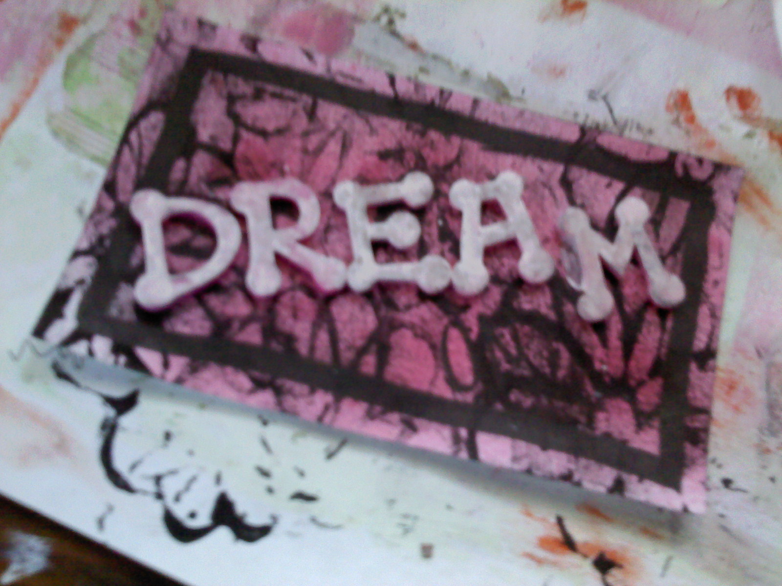
In this photo, you can see the layers quite a bit better. The cardstock piece is the one with the doodles on it. I collaged stuff down until I was satisfied with it, then used my fingers to paint in the rest of the gaps with pink and white layers. Of course, there was more done than that, but, for the most part, that was the general gist of it. 


Also, just as a bit of a parting farewell, I thought I would share a picture of how bulky the tabs are starting to get. Personally, this is my favorite part of my 2013 journal so far. Of course I love the individual pages, as it really expresses how I've been advancing as an artist, even over the course of just this new year. However, the collectiveness of it all is what really makes me proud. When a journal starts to get full and bulky, it just makes me well up inside. It just looks so cool, and is so fun to flip through the pages, just to see what's going on. What was happening in your mind when you did the things you did. And now I can tell when I was thinking those things, which is a cool aspect.

Also, I'm thinking that sometime over the weekend I'm going to be working on the cover for this journal. We're already halfway into February, and I still haven't done that. I think it's going to be a necessity, and I'm looking forward to creating something I'll be able to look at with pride for years to come.

However, before I go, I would like to thank you guys. I've been really enjoying being back with you guys again this year; I've missed art journaling in general, more than is even possible for me tho humanly explain. It's something that keeps me grounded. And when I separate myself from that, I'm lost. I'd like to thank the followers of this blog. The people that visit me and read what I have to say. The people that look at my art and leave me comments about how inspired they became after seeing my work. That's amazing. It makes me feel good, and is literally the highlight of my day. However, even though I may inspire you, it's you guys that inspire me. So thank you! And I hope you all have a GREAT day. :)

Tuesday, June 12, 2012

In The Sun, 30-30-30, and ICAD2


Hello everyone! How are you all doing today? Well. I hope it's good. But you know I can't really hear you from my living room. However. If you answered me out loud, you are officially awesome. If you want to answer me out loud right now, then you can still be considered awesome. If not, then I guess that's okay too.

I had quite a bit of fun with my art today. And this my friends, is the reason that I love prompts. I'll get to the reason why in a moment. At least one of the reasons.


The first thing that I worked on today was my second page for the In The Sun Class. Today's prompt told us to write some things about summer. Or to summer. And then we were prompted to doodle on our magazine page. Or photo. Whichever thing it was that we happened to choose. Well here's how it went down for me. I decided that, for this particular page, I wanted to use an image from a magazine. i wasn't really sure which photo I wanted to use, or even how many magazines I was going to have to look through before I would be able to start.


But it just happened that the odds were in my favor today. Ever in my favor. I was looking at the pile of crap to my right. Don't question the pile. Just leave it alone. And right there, at the very BOTTOM (of course) of the pile, I saw a magazine page. I didn't have a clue in the world what was on this page. But I was so tempted to pull the page out from underneath the teetering stack, that I didn't even try to resist. And as soon as I did, I was glad that I had done so. For this image is what stared back at me. I was so excited about it, mostly because this journal is supposed to be celebrating summer. Well. In my opinion, there's nothing that screams summer more than lemonade. Besides a pool. Or cookouts. Or basketball. But that's beside the point. The point is that this photo was absolutely perfect for my page. AND I loved, and still love, the colors.


I cut a portion of the image out, making it purposely smaller than my page, so that I would have room to journal. Which was one of the prompted things to do. I wrote my little notes about summer around the page, and I loved the way that it turned out. I had just enough to say, and just enough room to say it. Don't you love it when that happens? I know I do.


Then I added the title. I wasn't quite so sure what I wanted to do about the title, but I decided on a very simple "I Love Summer". One of the reasons that I love summer is that school is out. But I'm sure that before long, I'll probably be ready for school to start back up again. We'll see. I seem to be keeping pretty busy, with the blogs and my business and all. If you think about it, perhaps consider visiting my business blog here. I've been posting little snippets about the upcoming fashion line, and today I started a "What I Wore Today" series. And my partner Sarah is starting hers tomorrow. I think. 


The final thing I did to this page, which I absolutely LOVED was doodle. I had been prompted by Natalie to doodle on my photograph. Well. I started out with just a little bit of doodling around the top of the cups. But the more doodling I did, the more I just couldn't stop it. I ended up doodling around the entire outline of the photograph, and I love how it turned it into an almost cartoon - esque photo in and of itself. I really love the way it turned out, and I'll probably try it again very soon.


Actually, I was so inspired by the doodling on that page, that I continued that on my 30-30-30 page today. I'm not really sure WHY there's a photo of lemonade (or limeade, or whatever it is in this picture) on a page about sports. But we'll go with it. I think it might have something to do with the fact that sports make you thirsty. I think that's probably it.


But yeah. I continued the theme of the doodling on photographs over to this page. And again, I love the way that it turned out. I did journaling on this page though, which isn't something that I did on my other pages. I think that had a lot to do with the fact that I didn't have a clue in the world what I was going to do in that blank space. But I had some red paint on my pallet, and so I painted on some journaling lines and got to work.


This page was a little more difficult time-wise than the other two pages have been. You would think that it would keep getting easier and easier. But it's not true. Not at all. At least not for me it isn't. The journaling took up quite a bit of time, as did the doodling. I was getting to the point where I thought that I wouldn't finish. It was kind of a race against the clock. But it felt good. Almost like adrenaline. A rush. Who knew you could get a rush from doing art. Ha. But I always do when I do math, so I don't know why this would surprise me.


Here's a bit of a better photo of the doodling that I did on this photograph. I was a little more free than I was on my other page, but the time constraint really fed into that. I had to work a little bit quicker, so I couldn't be nearly as neat as I was on the other page. But I like both of them. Both of these pages turned out quite nicely in my opinion, and I love the way that my art seems to progress as I work on it. Sometimes I look back at my old scrapbook pages and wonder what the heck I was thinking. But then I come to two realizations. One, these were my very first attempts at paper crafts. I can't expect them to be as good as what I'm doing now, or as good as what I want to do now. I'm sure that a younger me would be shocked to see how much they would improve. Two. I was seven.


Here I present you with ICAD #12: Experiment. Now this card; I tried a few techniques that I haven't before, and a few that I haven't done in a while. It seemed to be a nice little refresh of some of the techniques that I had almost forgotten about. Anyways. The idea for this card sprung from an old technique that I'm sure a lot of you probably haven't thought about for a while. Drawing on a piece of paper with a white crayon, then going over it with watercolors. Or markers. Or a wash. I used to do that when I was really, really young, and all I did was color. All day. Every day. I thought it was fun. But I was thinking the other day. 


It's the wax that resists the mediums you put on top of it. Not the color. So would it work the same way if I did the same thing with colored crayons? What would happen? Well, I tried that out. I took some crayons in yellow, orange, and red, and drew dark, waxy swirls all over the base of my index card. Then I went over it with a reddish-orange watercolor paint. And it did work. And it looked pretty cool. A couple layers followed after that; red artist quality paint applied with a pallet knife, followed by a layer of yellow poster paint, which blended with the not yet dry paint. And this was the result. I added the caption and was done with it. And I like it.

That's all I've got for you guys today though, and I hope to see you tomorrow! Bye!

Thursday, May 31, 2012

"Extreme" and "Artfest - Cover"


Okay. Today I have two pages for you guys to see. And they are both very, very different. That's the way I like to work though. I feel that if I'm not limited by just one style or medium, then I'll always have countless ideas running through my head; endless miles of ways that I might be able to roam. I love that aspect of it. It's so inspiring. Anyways. The first page I have to share with you is from a prompt, like the last few pages have been. 


Today's prompt asked me the last thing I had said. And that was a single word. Extreme. I know it's kind of weird. But then again, I'm kind of weird too. And I'm proud of that. I kind of took this word out of context however, when it came time to work on the journaling. When I had actually said it, I had used it in the context that the case of hiccups that I had just got over was kind of extreme. But in the journaling, I focus more on the aspect of my personality that forces me to go to extremes to get things done.

For example, I was supposed to leave my math exam at noon today, but I wasn't finishes. So I stayed two and a half hours afterwards so that I would be able to finish. My teacher didn't mind. She said that she liked the company.


I wasn't super fond of this page personally. I like the way it looks, but it really doesn't seem to scream me - not the way the rest of my pages do. It's too subtle. Too delicate. Plus, I think the title "Extreme" kind of calls for something more bold and edgy. But it's too late now. I do think it's pretty. I just don't think that it goes with my style.


 Here you can kind of see, on the right side page, a little bit of what MIGHT be coming tomorrow. Since the flowers are in the very first layer, they could very well be covered up by the time I get to the blog. However, I do have a little bit of a plan. So we'll see. Those flowers, by the way, were made up of the excess paint around the edges of a stencil I used. Just flip the stencil over, and you get a negative space image. Pretty cool, huh?


And here we are. With yet another page. Actually, it's a cover. But that's beside the point. I made these magazine journals a little while ago, and I posted them on the blog back in August. And they have just been rediscovered. By me of course. The moment I saw them, I knew that I had to work in one. A new one. Brand new. From the start. And I wanted it to be interesting. I had just finished the previous page, and I knew that I needed to do something bolder. Edgier. More me. And this certainly accomplished that for me.


The colors are a little bit darker than I've been using lately, but I really like the way this turned out. I love how the circles are so imperfect and wonky - I dislike everything being even and perfect. To me, this is just more appealing to the eye. More interesting and intriguing. If you think otherwise though, that's fine. Not all art journals need to be messy and put through a lot of wear and tear. If you want your art journal to be even, pretty, and have everything to a tee, then that's part of your style. This is a small part of mine.


And I'll leave you guys tonight with a bit of a better view of the title for this journal. I printed this out from an online source; it has the title "Artfest" being signed out in ASL (American Sign Language). I just thought that it was cool, and it really jumped out at me when I was searching through my little box of collage goodies to find a title for this page. And with that, I wish you a good evening, and many more happy, arty days!

Wednesday, May 30, 2012

Balanced


So I'm back with you again today, a little earlier this time. I was off of school today, since I exempted most of my exams. The way they do them at my school is that on Wednesday they do 1st and 3rd period exams, and then Thursday (tomorrow), they do the 2nd and 4th period ones. I exempted all of my exams except for 4th period, as that is my math class, and my teacher doesn't allow anyone to exempt, no matter how good their grades. So tomorrow I have to go at 10:10, and then get to leave at noon. It's nice. And today I didn't have to go at all.


Yep. Today I was working from yet another prompt. This one begged the question. Are you more child-like or childish? I spent quite a bit of time considering the answer to this. I eventually came to the conclusion that I thought I was a little bit of both, especially depending upon who I'm talking to or hanging out with.


The idea for this page initially sprung from the primary colors. I was going to do my page with just those colors and see what happened. As you can see from the pictures, a lot happened. Not a lot of any of those colors actually show up in the finished piece. 


You see, what happened was, I had just started the page and I thought it was looking okay. I thought that it looked a little weird, but I decided to continue on anyways. Bad idea. The more layers I added, the worse it got. Seriously. It was really bad. So I just went over the entire thing with white paint. Some of the red from my previous layer got caught up into the white, and gave me a pink tint. I decided to just go with that and start over. Let's just say that my journaling in the first layer is extremely secure. Nobody's going to be reading that sucker. 


In this picture, you can sort of see a close up of the texture I used in this piece. Since I've started working in my journal a few days ago, this is probably the most texture I've gotten on a page. I simply love the way it turned out. Even though pink is definitely not my favorite color in the world (it's blue, in case you're wondering), I do seem to love pink paint. I don't know why. I just do. 


The journaling in this page, like in my previous page, really means a lot to me. I don't know where I get some of this stuff from, I just pull them out of the air. I seem to love taking cool words and merging them together into deep, meaningful sentences. To me, writing is seriously an art in and of itself. As it is to many other writers. 


I'd like to leave you with a link. This is where I've been getting all of my prompts from. They originally weren't supposed to be for art journaling, but the moment I saw them, I knew that they would be excellent art journal inspiration. It is called the 5,000 Question Survey

Some of you may have heard of this before, and others may not have. That's what this blog is for. For me to share with you guys new things. And new ways of reusing old things. And with that, I bid you farewell and an excellent evening.

Tuesday, May 29, 2012

Medley


So I worked on another page today. Today's prompts was to consider where you think you are in your life right now. I had a good, long think about this topic, and finally came to my conclusion. I think that I'm in a place where I like to think about things. I want to make sure that they're right. And, most of all, I want to have an opinion. That's something that many people don't know about me. And that is, that I am a very opinionated person. I like to consider all of the possibilities, and then come to an overall conclusion. I like to know that I'm being accurate in my decision, and make sure that I'm correct in the way that I'm thinking.


This is an overall page view of the whole layout/page that I did today. When I started out, I thought that I was going to be using mostly red. That gradually changed into pink, which turned into brown with pink accents. And orange. Orange accents.

There were a lot of layers to this page, and I love how this turned out. One of the problems that I will sometimes have are all of the colors in my page muddling together. I don't like that. However, sometimes, on some days, on some pages, I think it's okay. And I think that this is one of these pages. The way that the different shades of brown and pink merge together add a lot of texture and depth to the page, and I love the way that it blends together.


Also, I thought that I'd share with you the finished spread in my journal. I know that these two pages are two separate pages, but I just thought I'd share something with you. Some people, when they are new to art journaling, struggle with single pages. Their reasoning for this is that they don't like having to make sure that the two pages go together. But here's the thing. With an art journal, it honestly doesn't even matter. In this spread, one page is on the cool side of the color spectrum, and the other page is on the warm side. But it's okay. It looks fine. And nobody's going to judge me because they don't go together. Even if they do, I wouldn't care. My art journal is about what makes me happy! The same should be true for you.


I'm going to leave you today on a rather thoughtful note. I'm going to type out my journaling. I really like the way that it turned out, and I think that the thoughtfulness aspect of it truly represents me.

I have a very unique style. I am composed of a variety of things that make me happy. Me. Not anyone else. Actually, I could care less what other people think. I am a medley of all things me, not a collage of all things everyone else. Some people might consider my style eclectic, while I prefer to consider it mine. The point I feel I am in right now, in my own life, is a time when I think everything through to the extent that it needs to be. I am always thinking about my own take on things; always considering a new aspect to life. To my style. To my medley of me.

And that would be that! I hope you guys have a good rest of the day, and I'll talk to you later!

Thursday, January 26, 2012

Graphic Art Journal Page


Today I've got another unfinished page for you guys. This happens all the time, I know, but I'm just hoping that you guys are liking it too. :) I just like sharing. This page is a very graphic type of page, which is very different than most other pages that I have done in the past. Normally, I do a bunch of layers, which will eventually end up looking pretty cool. But this was inspired by a class on 21 Secrets, which I enjoyed while it was still alive. Now that one is dead and I'm being forced to work from the PDFs. :) Actually, I don't care as much as I'm trying to make it sound. I think that it's fun, and forces me to use my imagination more than it would otherwise. Also, the colors of this page are a bit different than what I am used to working with. I enjoy using pinks and purples on occasion, but it seems like I'm using them more and more lately because that's what I have left. Yeah. That's the way I roll. Anyways, because it's getting kind of late, I think I'm gonna go. I know that I don't have that much for you today, but I'm hoping to come back tomorrow with a tutorial. We'll see. We will see.

Friday, January 13, 2012

Doodled Art Journal Page


Hey guys. I'm back with you guys once again. Sorry that I'm so late getting to you all, but I've been having tons of technical difficulties today. First off, I was trying to get a video to give you guys, but it didn't work out, and not only did it not post to youtube after hours of trying to get it on there, now it's too late for me to try any longer. Also, I've written this post once before already, but the entire web browser didn't respond and then just automatically shut down. So I'm sure you guys know how I'm feeling right now. But I'm just glad that I'm able to get to you guys at all. Even if it is kind of late. So we can start off by talking about this page. I loved working on this page. LOVED it. When I started it, it was very simple. A gray paint as the page background that I simple spread all over the place with a paintbrush. The pink was a pallet knife that I used to spread the paint, and the brown was some that was leftover from another page; I used a paintbrush to spread that too.

The doodling was the most enjoyable part of this page. One, I love the way it looks. It's so fun and inviting, and has an almost playful demeanor. I love the way the white compliments the page, and I found the pen to be a pleasure to work with. I used a Sharpie poster paint marker, and I found them to be very enjoyable. Even though I've heard mixed reviews about them, I've had nothing less than an excellent experience while working with them. They're amazing. Plus, just a fun thing to add to my repertoire of techniques and collection of supplies I have now to play with. And that's that. I'll see you guys tomorrow!

Friday, September 2, 2011

Art Journal Page + Dream Index Card


Hey guys! I'm back with a bit more of my work for today. I love working in my journal, and I managed to make a few things today. :) I'm participating in quite a few monthly/weekly/daily challenges. I'm kind of addicted to these, but they're so fun that I can't help it. :) If you look at the page above, you can see something that I've been working on. It's in my art journal for 21 secrets. I started out with an oil background. I loved the way it looked, but I just didn't know what to do from there. I stenciled some flourishes on it with black poster paint, and then I ended up painting over the entire thing with a burnt orange paint. I lifted some of it off with another piece of paper, creating a sort of distressed look. Then I went over the whole thing  with gesso, and painted stripes of the same burnt orange color. That's all I've got so far on THIS page. :)


And this last thing that I've got for you. A 3x5 altered index card. This is something new that I'm starting. Over at daisyyellow, in the month of September, she challenged us to make 25 altered index cards. Her and a bunch of other people did the same thing over the summer, and I started near the beginning, but it ended up just being an epic fail. This was a really easy card, and there were really only five or six layers to it. The first layer I just took my index card and sprayed it with some glimmer mist. After that I used a foam stamp and some black poster paint to put some flower on it. I smeared those around with my fingers a little, and then drew a frame around it with a marker. I sprayed one more layer of glimmer mist over the top, then added the letters. They were all different colors, so I painted them a bit, and lifted some of it off the top with a piece of book paper. And that's all she wrote. :P That's what I've got for you guys today, and I'll see you tomorrow. :)
Related Posts Plugin for WordPress, Blogger...