Showing posts with label tutorial. Show all posts

Wednesday, January 18, 2012

Watercolor and Acrylic Background Tutorial


Today we are going to be focusing in on another tutorial. This was actually scheduled for yesterday, and yesterday's was for today, but I decided to switch it up a little. Normally it's going to be "Tutorial Tuesday", but I guess today it's going to be a Tutorial Wednesday. That's not too bad. Anyways. The tutorial that I'm going to be showing you guys today is how to mix different mediums to create one cohesive piece. That's one of my favorite things to do. Mix different kinds of materials in one thing. That's why they call it mixed media after all. Okay. So first things first. What we're going to be making. You can obviously do this technique anywhere that you want, but the easiest way for me to do it in a tutorial format would be to show you on plain pieces of copy paper. You could do it on cardstock, mixed media paper, in a journal or sketchbook; anywhere that you would normally use any other technique that you find floating throughout the internet. Let's get started.


The first thing that you're going to do here is prepare a pallet. You've seen me doing this on multiple occasions, so you're probably pretty used to this by now. Now let me give you a really quick run through of the supplies that you are most likely to use. You're going to want a little bit a tube watercolors. This forms the background, and is used in many layers throughout the technique. Next, you're going to want an acrylic paint in a similar, but NOT identical color. If it's identical in shade, then, in my opinion, it will not have enough variation to make an interesting piece. You could try it though; I haven't yet. The last type of paint that you're going to be using is just a plain white acrylic. I am using a poster paint, but you could use any kind of acrylic that you like. You're also going to need some paper (or whatever surface that you are going to use), and a paintbrush. The paintbrush that you use for this technique NEEDS to be one with the natural bristles. The roughness of them gives the right texture that we need for this technique. A softer brush will not work.


The next thing that you are going to do is mix a little bit of your tube watercolor with water, and spread it all over the page. Make sure that you are very haphazard with where you are placing your marks, and don't over think it. Just play with moving the color around on the page. I cover almost the entire background in this first layer, but you can certainly do a lot less if you wish. This is just this particular page. I first came up with this technique when I was just playing around with a bunch of supplies, so it's a very experimental technique that is very open to suggestions.


The next step is going to be to add some white acrylic paint to the page. Again, be very spontaneous, and don't worry about what comes next. I added some layers of the watercolor on top of this, and then alternated back and forth, blending a bunch, and just trying to come up with an effect that I enjoyed.


To finish off the technique, just work with the supplies you have. I added the acrylic paint, and mixed that with a little bit of the white paint. Then I took a paper towel and lifted some of the paint up off of the page, and then dipped it in watercolor and dabbed it over the page. I also added some more layers over top of that, and finished off the page by putting some little rectangle splotches of watercolor over the page. This technique will be very different each and every time you try it, so be prepared for that when you do it. As you can see, this blue page is a lot different than the pink one that I showed at the beginning of this post.


I don't really know what's up with me lately and making big batches of colorful papers, spreading them out on the floor, and taking pics of them to share with you guys, but I guess I just love the way they look. These are all pages that I did today in about a 45 minute time slot. As you can see, you don't have to have a lot of time to create a bunch of quality backgrounds.


This is just another angle of a couple of the pages, and a few others. Some of these were done with this technique, and others just used portions of it. Some used none at all, and were just made because of the fact that I had leftover paint on my pallet that I wanted to use up. That's another thing that I tend to do. I hate being wasteful, so I'll make tons of other papers to make up for the paint that I would otherwise just throw away. That's what I've got for you guys today, and check back tomorrow for yet another post.

Monday, January 16, 2012

Pallet Cleaning Tutorial


Hey everybody. I'm back with you guys today, and I've got something that I would call kind of cool. Although I'm kind of biased in that aspect of course. :) So today I've got a little type of tutorial for you. I know that a lot of you out there in the painting and art world use pallets to hold your paint. I don't really know how many of you let the paint cake up in it like I do, but I'm going to show you a fun, creative and useful technique to clean it, if you do this. It's fast, it's easy, and it's not as wasteful as just dumping all of that excess paint into the drain. Plus, that's probably not the best when you want to keep your drain unclogged. So let's get started.


The first step is to choose which section of your pallet that you want to clean out first. But let me note first that this method of cleaning is a bit slower, but it's a cool technique in the long run. After you've chosen the section that you want to clean, you're going to dump a little bit of water into that section. Then, you take a paintbrush, and mix it around. The paint will mix with the water, coloring the water and dissolving the paint into the water. I must tell you that this doesn't work with all types of paint, but I always find that it's at least worth a shot.


Then, you just load up your paintbrush with the paint and the water, and spread it over some paper. It works the same way as a color wash does, and gives you lots of colorful, pastel like pages to use in your work.


Here's a pile of papers that I did just today off of my pallet. They always seem to turn out nice and colorful. Just a hint, darker colors work best for this technique. That gives it a bit more colored pigment to mix with the water, and it doesn't turn out as just being a hint of color on the paper that is barely even there. Anyways. That's the tutorial for today. I hope that you guys enjoyed it. One last tip though, is that you can use these papers and scrape paint on top of them, stamp on them, stencil them, spray inks, and in other words just layer over top of them. A lot of times they can turn out really well, and you can never tell that they were made from leftovers. And there's no shame in that.

Thursday, January 5, 2012

Stenciling Tutorial!!


Hey all! I'm back with you guys again today, and a lot earlier than yesterday, if I do say so myself. :) I'm really excited to share this tutorial with you guys, as I've sort of been keeping you guys in anticipation. I guess I've left you hanging long enough. Let's get started, shall we? We're going to start this tutorial off with a background. For the purposes of this tutorial, as I wanted it to be mainly about stenciling, I did not walk you through the steps of making said background. But this can be anything. Personally I like to look for very simple, linear designs that just look like they could use a little bit of spicing up. I looked through my journal, and this page really called to me. Very simplistic, but I love the colors of it. They're so cool.


The next thing that you're going to do is to try out a couple of different stencils. I flipped through lots of my stencils, and laid them over top of the background so I could sort of get a feel for what the finished stenciling would look like on the page. I looked at two stencils; a sun looking one, and my favorite; the flower. I would have used the flowers, but I really liked the way the suns looked. They sort of worked with the whole color scheme of the page. I know that sounds weird, but shapes CAN relate to the color scheme of the page. If you stencil the wrong thing, then you could EASILY end up "ruining" the page, or, at the very least, ending up with an ugly layer. And I tend to like to avoid those layers if at all possible. Now you're going to choose a color to stencil in. I didn't photograph this part, mostly because I didn't know how to. I thought about using a black, but it ended up it would have looked too harsh. Then I looked at a burgundy color, but that was too bright. I ended up mixing a bit of black with the burgundy to come up with mahogany.


Next you're going to take a paintbrush and paint around the edges of the larger segments of the stencil.


Then you can fill in the rest of the space with the paint.


And then the rest of the large areas.


After that you can simply fill in the rest of the spaces with the paint and peel up the stencil. This is a really grungy method of stenciling, and since that's my style it doesn't really matter to me. If you want, you can be a lot more careful, but the steps are done exactly the same way. I hope that you guys liked today's tutorial, and I'll see you guys later!

Wednesday, September 7, 2011

ICAD #6 + Background Tutorial


Hey guys!! I'm here. Once again. :) Yes. I'm so happy. :) Today I've got a really cool thing to share with you. I was working on an index card today, and came up with this technique, so I decided to share it with you guys. You know how I was telling you about "lifting" paint onto cards? Well I started with one of those today, with a dark blue background. You can see how cool this looks so far.


Now I just used some yellow poster paint and totally covered the entire background. I coated it on there pretty heavily. It looked green instead of blue for a second, but I take care of this in the next step. I love it so much.


You simply take another card and place that down on top and lift it again. So see what I've got? Two backgrounds already. :)


And for this finished card, I took the yellow and blue card and painted blue all over the top of the card, and lifted once again. The other one looks pretty cool too; the one I used to lift it off. Then I simply collaged the piece down in the corner. I'll show you the lifted piece tomorrow. :) I was also working on some backgrounds and stuff for my color challenge with Dede. I'm so excited for that. :) Working it to the extreme. :) And that's all I've got for the day. See you guys tomorrow. :)

Saturday, June 4, 2011

ATC Background Tutorial


A little while back I did a tutorial on ATCs. I love to make the backgrounds a bit different on each card. These are some of my favorite backgrounds to use, and they're so simple. They only use a couple of supplies, and they're really easy to make. The photo above shows what they look like. You can make these in any colors you want, but I recommend darker, more vintage looking colors. The style of this technique just goes better with those types of colors.


These are the supplies needed for this technique. I actually designed/developed this technique in order to use up older, dried up old baby wipes. So you're going to need one of those. You'll also need an ATC blank in white, a spray bottle full of water, and ink pads in two coordinating colors. With the inks, I recommend Distress Inks, since they react with water, but if you know of another brand that does the same thing, feel free to use them. I'm using Aged Mahogany and Vintage Linen.


Here's the ATC after I've already put the lighter color (the Vintage Linen), and am starting to apply the darker mahogany color on top of it. I like to use two colors, since I think that it adds more color, texture, and dimension to the finished piece. When you apply the color, either dab the ink on, or rub it back and forth on the pad. Then rub it lightly against the paper in light circles.


Here is the ATC after both layers have been applied. You can see how on the edges it is a bit darker. I like it better that way. It seems to add dimension. I don't know about you, but I like it. You can also make it more even if you like; it doesn't matter to me. I like the look of it. :)


Spray/mist the ATC back with a bottle of water, making sure that some of the dots of water are bigger than others. Let it sit for a minute and...


Scrape or dab it off with the baby wipe. This is what the finished piece looks like! I love it!! I hope you guys try out this technique, and, if you do, feel free to post it in the comments. I'll come and visit you!

Note:: This technique can be used in any way you like; in an art journal, mixed media, ATCs, or any other thing you can think of. It doesn't matter! Just play around. That's what matters.

I hope you guys enjoyed today's post, and I'll talk to you later. Bye!

Wednesday, March 30, 2011

ATCs Galore!! (And a Tutorial!)

Hey all! Okay, so I know that I promised you all an ATC tutorial when we last met, and I'm not one to break my promises. At least I try my very best not to. :) So anyways, I'm here with some ATC's. No lie. So here's the deal. Some of these steps may seem pointless, worthless, or meaningless. And I almost guarantee that at least one of them will seem that way. But when it actually comes down to it, and you dig out all your supplies in order to try and make SOME sense of this tutorial, you'll thank me. ;)

So first off I'd like to start with a basic definition of an ATC. An ATC is a miniature piece of art. Otherwise knows as Artist Trading Cards. Thus the acronym. So basically what you do with them is to take your medium and work with it on a miniature "canvas", which is 2.5"x3.5." An ATC can be worked in many, many, MANY different mediums, so you never can be quite sure what you'll receive back when you participate in a swap. Some people collage, some paint in watercolors, some in acrylics. Some draw theirs, and some even embroider (a medium that I have yet to try in ATC form :O) theirs. For my example I'm going to show you a collaged one. (For the time at least)


Okay. To start off, you need to collect your supplies. I collect a vast variety of supplies, pulling anything and everything that could possibly match the idea I have forming in my head. That's another thing to note. When I'm working on an ATC, I normally have a basic idea in my head, though it is only in the VERY beginning stages. Don't be intimidated by my large pile of supplies (otherwise known as arty crap); I won't use them all, only a few of the actual things in the pile shown will be used.

I'm more of the out of sight, out of mind type. So having all of my possible supplies out in front of me (even for something as small as an ATC) is very helpful. Notice that I have various images, stamps, papers, inks, punch outs and punches, trims, tapes, embellishments, and paints sitting out in front of me. I'm telling you, it totally helps.


A closer shot of the various papers I was trying to choose from. I had a piece of a magazine image, a paint chip, several specialty papers, and some pages from an old book. These show the variety that can be used. For a tutorial, I should have also included some cardstocks, but unfortunately they didn't quite match the vision I had in mind for this particular card. Also, don't be afraid to choose and pull several papers. Or even try out several for the same image. The thing with this kind of art is, that if it doesn't work, just use it on something else. :P I'm telling you; my method's foolproof.


The next step is to cut your paper into 2.5x3.5" rectangles. When you are cutting and measuring for this step, make sure that they stay pretty true to the initial measurements. When you're just getting started it doesn't matter that much, as you're probably not going to be trading your first cards, but when you get started trading they need to be pretty precise. Some people even think that if the measurement varies too far from the right proportions, then they cease being ATCs!! So be careful. One more note on this picture; as you can see, this is actually a perfect example of the tip I mentioned in the last paragraph in action. I couldn't decide between the specialty or the text paper for my image, so I cut one of each and tried out the image on both. It gives me a better visual. Also, the one that you decide not to use can always be used for your next card. :P


I decided on the specialty paper. It just seemed to work right with my image. After looking at it for a moment, I decided that it seemed a little plain, so I jazzed it up a bit with a cursive background stamp. You can see that the bottom stamping defiantly isn't perfect, but you won't be able to notice in the finished card.


Next up on the list; paint! I love paint for all of my projects, so when you mention collage ATCs, that's sort of the first thing that comes to mind. Don't ask me why, it just does. When I looked at what I had already decided, I thought that a more monochromatic type scheme would work best for this project, so I found a nice metallic bronze. You can't really see here, but it's actually a bit sparkly and shiny in real life.

Also, instead of using a paint brush to spread my paint like a "normal" person would, I use an old credit/gift card. They're sturdy and fun to use and they sort of resemble a pallet knife when they're used. Plus, as an added bonus, I don't have to clean any brushes; I just let the paint dry on the card! I'm a lazy bum when it comes to art, I admit it, but I don't really care...


This is what the card looks like after being spread with metallic paint. I told you it resembles a pallet knife!! And can you see the sneak peek of my image there in the corner?


Now for the stamping. I like to add at least a bit of stamping to each of my cards and art journal pages. Actually, anything that uses even a bit of collage automatically needs some stamping. Sometimes I use rubber or acrylic stamps with ink pads, but this time I thought the card was calling for something drastic. I used a large (and I mean LARGE) spiral foam stamp with black acrylic paint. It gave me just the look I was going for!! If you want another tip for stamping, here's one for you; when stamping on anything (art journal pages, inchies, ATCs, scrapbook pages, etc) always stamp at least SOME of the images off of the edge of the paper. It gives it a nice cohesive effect.


Next, I went over the entire card with a layer of distress ink. A tip for using this stuff is to NOT apply it evenly. I know that it goes against everything you've ever learned about crafting. Ever. But trust me. It really works, and just adds to the distressed effect that's so popular recently. Now that I think about it, I should really do a distress ink tutorial/technique examples post. Hmmm...


Next I placed my image on the card. Isn't the owl so cute?! Anyways, you see how the tip of the owl's tail has a streak of black on it? Or how the sentiment has a streak of metallic brown running through it? That was an accident. Purely mistake. But unlike some other people, who may have tried to cover it up, or even reprinted the entire thing, I just went with the flow. It's the same way as when I'm working with an art journal page. Almost every single time I sit down to create, another color gets mixed into the white background. Instead of getting upset, and either trying to cover it up or flipping to a new page, I just use it as a prompt! For example, if a bit of green gets scraped onto my page since it was left over on my pallet, I simply make a green page! Great inspiration.


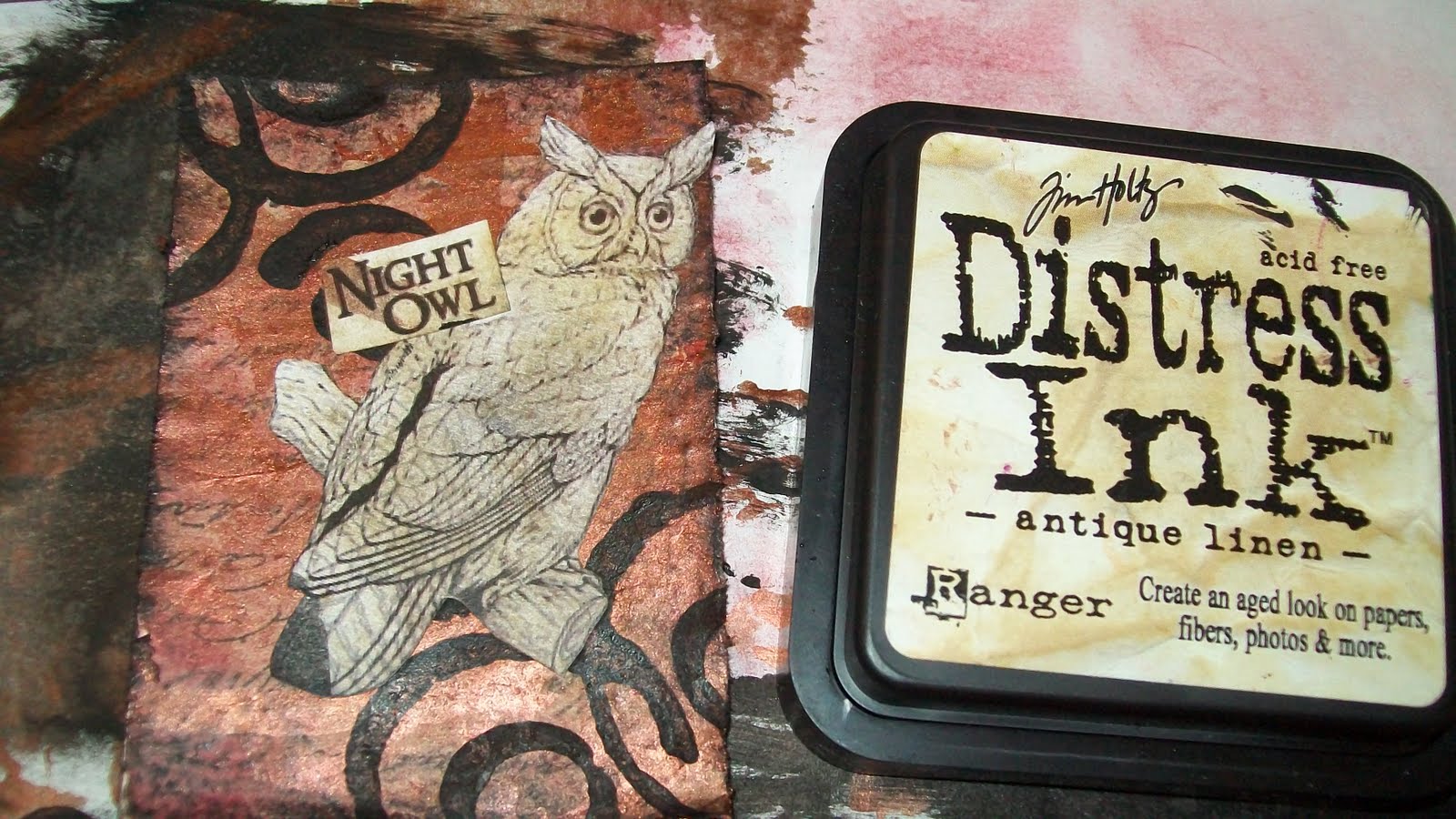
Okay, anyways, back to the card. I thought that the above owl was looking a little bit white for the card, and it felt like it stood out too much. So, I went over it with an small amount of antique linen distress ink. I love this stuff and I'm proud!! :D

So anyways, here's the finished card. I just added the small piece of black electrical tape in the lower left hand corner and spotted it with white stickles (which is a professional glitter glue which has much more sparkle than regular glitter glue. Though I'm not really a sparkly/glitter person, when I do want bling, I want it to sparkle!)

So that's about it!! I know that the post was long, and maybe a bit annoying to read the whole thing, but I hope that I at least helped somebody with this. I know that I had fun writing it! Enjoy!

Related Posts Plugin for WordPress, Blogger...