Hey guys! I finally managed to get on here after a LONG day of practicing volleyball.
I literally left at 10:30 and didn't get back until 5:00.
Very tiring, but I had some time to reenergize, and now I'm on here again. ;)
Sorry I didn't post yesterday, but sometimes my Saturdays sort of slip away from me.
I keep putting stuff off because I think I'm always going to have time.
But as we all know, this certainly isn't the case.
Unfortunately.
Anyways, enough with the apologies and the comments about my social life.
Let's get down to business.
The artsy-craftsy part. :)
You know what I'm talking about.
Today I did quite a few things.
But I'm only going to share two of those with you guys today.
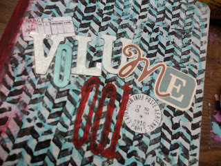
The first being a journal COVER.
This is pretty different from I normally post;
I normally do art journal PAGES and maybe an altered book page.
Depending on my creative mood that day.
You know how it is.
Some days you've got it, and others you don't.
And you just have to push through.
Anyways.
Yes.
I have an art journal cover for you guys today.
In the past, I've actually never done fancy covers.
I generally just paint them black, and use a bright color for the spine.
It's a nice simple look, and it's fun.
But today, as I start a new art journal for a course I'm doing on Wild Precious.
I just thought it was appropriate.
Here's a picture of it a bit closer up.
For my first 'Volume' I also found it appropriate to do it in one of my fave color combos;
Turquoise, Black, and Red.
Mostly turquoise, a little bit of black, and hints of red.
I know this is a common combo.
But I love it.
It's so perfect to describe my style.
Bright and airy, yet sophisticated.
It works well in a grungy layout.
Or in a clean and simple one. That's good.
Because I do both.
This is more of a grungy cover, and I do a lot of my stuff that way.
But sometimes I do go simple.
Anyways.
I did a lot of layering of stamping with paint on this cover.
I thought that it should be perfect because I would have to be looking at it for as long as I'm working in this journal.
Another thing about this journal is that I'm thickening the pages.
While in the past I haven't.
What I'm doing this time is gluing two pages together.
And then collaging a bunch of phone book papers on top of it.
Then add gesso.
The pages are super thick, and AMAZING texture is added.
So far I haven't worked in it yet,
But since I did some prepping I probably will soon.
The second thing I have for you guys today is an ICAD card.
I know what you guys are thinking.
FINALLY!
I know.
I'm totally physic.
I'm just cool like that.
Anyways.
I did this card today using a technique that had been left in the comments section of one of my posts.
Before I go one, let me say one thing about comments.
Thank you for leaving them.
They inspire me, and I really do read EVERY SINGLE ONE.
I do a blog run through, just to see them.
Thank you.
They are so inspiring, and if you leave me a technique to try, I WILL try it.
Try it.
Leave me a technique in the comments.
Anything.
I will get back to you on it.
Anyways.
Back to the point at hand.
One of my viewers left me this comment, and I was so intrigued I had to try it.
Basically what you do is you take your base.
And color all over it with different color of crayons.
Be completely random.
Then paint the whole thing with black paint.
Then scrape all the paint OFF.
I used a toothpick.
And that's it.
Isn't the effect cool for such a simple technique?
I love it. :)
It almost looks neon.
And if I haven't said it on here before, I LOVE neon.
So yeah.
Anyways, that's all I've got for you guys today, and I hope to see you tomorrow!!
Bye!!


love the journal cover and your latest technique on the index card
ReplyDeletesusan in australia
The icad I am going to have to try! And the journal cover you rocked it. And I am going to try the inside page idea. How many phone book pages will you collage on top?
ReplyDeleteI sort of tear the phone book into pieces and collage one "layer". Maybe I'll do a tutorial if people are interested?
ReplyDelete